Blog

How to Create a Successful User Experience at Your Next Live Event

Whether you are designing a website, planning an email campaign, creating a Facebook contest, or hosting a live event — you are consciously or unconsciously creating an “experience.”

User experience (UX) is the multi sensory summation of every customer interaction and it can greatly impact users’ emotional reactions.

Susan BordsonI recently met Susan Bordson for coffee (thank you for introducing us, Twitter!). I was so impressed by her that I wanted you to meet her, too. Susan is a strategist and creative director for business media and events. She helps companies ensure the content and user experience is on target for events such as fundraisers, galas, and corporate events.

Even though Susan and I work in seemingly different fields, we were surprised to learn we approach our work in almost exactly the same way. UX is everywhere!

Children's HeartLink Gala, Copyright childrensheartlink.org
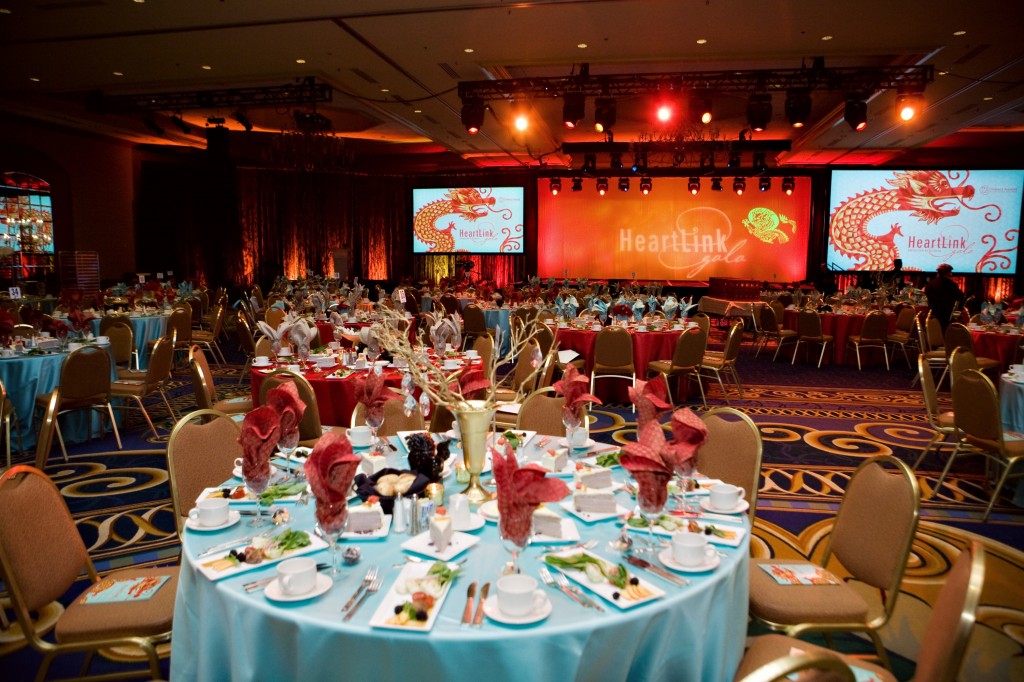
Children’s HeartLink Gala, © Children’s HeartLink (Photo Used with Permission)

User Experience Is in Every Interaction

Whether you are designing a website or live event, you are hoping to influence the outcome of that experience with your audience. Positive reactions are earned with targeted strategy and good design.

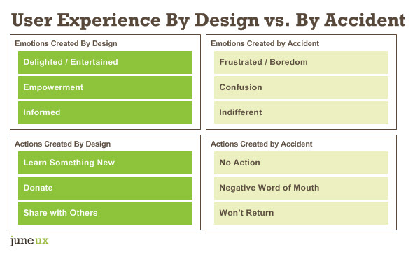
In every interaction with your company, brand, or product, you always want two things to occur:

  1. Your target audience to feel something positive.
  2. Your target audience to take a desired action.

Without thoughtful and strategic planning, you run the risk of your customers feeling neutral about your content… or worse. As a result of feeling less than positive about your company, your audience simply won’t take the desired action.

UX by design comparison chart

How to Plan a Strategic Live Event

To create the desired emotions and actions that you want your customers to feel and do, consider these 4 critical steps.

1. What is your focused objective?

As consultants, we often encounter clients who want to jump to content and tactics instead of first identifying focused objectives.

Take a nonprofit fundraising event as an example. It seems as if the objective is obvious, right? Raise money. Although this is true, further honing that objective will ultimately result in a more successful fundraiser.

The same thinking applies to any business event. The overall objective may be to educate, inspire, or empower your customers or employees. However, a more specific objective will provide a better blueprint for the design process. In fact, a general objective simply helps us start asking the right questions to get to the real purpose of the event or website feature.

Example Focused Objectives

  • Show gratitude to your significant long term investors

  • Deepen the relationship with your casual donors

  • Gain new donors who are just learning about you

2. Who is your target audience?

After defining your focused business objective, it’s time to identify your target audience and what will move them.

Clients sometimes say, “We want everyone to buy our product / visit our website / attend our event!” But the real question to answer is: Which audience is the most important right at this moment with this interaction?

If you try to achieve “everything” to all people, you’ll most likely miss the mark on everything and waste money trying. If you identify one focused objective and one well-defined target audience, you have better odds of succeeding and making sure your investment gives you a return.

Example Target Audiences

  • Engaged, long-term investors

  • Casual donors

  • Potential new donors

3. What is the right content & messaging?

Now that you have your business objective and target audience in place, you can begin honing the message. What is the single most important message you want your audience to retain from this event?

Example Content/Message Types

  • General overview: Providing high level brand attributes.

  • Education: Helping attendees understand something more deeply.

  • Trust & loyalty building: Sharing complex, nuanced information.

Strategy Tip #1: Weed out less effective content

People absorb a limited amount of content in any interaction. With focused objectives, it’s easier to edit.

For example, you may have an executive who wants to speak at every single conference hosted by your company. If their content doesn’t align with objectives, it’s easier to make the case to say “no” — without hurt feelings.

Strategy Tip #2: Leverage the “Law of Attraction”

A focused message strategy makes it easier to attract great speakers. If you can show how their content perfectly fits with your audience, they’ll be more eager to participate.

Bonus tip: If you share your focused objectives early on, there is a greater chance they will customize their content specifically for your event. Great speakers appreciate this kind of input.

Strategy Tip #3: Choose the right tools

Objectives also help when choosing the communication tools for each message component.

A typical business event includes speakers, screens, print collateral, signs, multimedia, music, staging, and live entertainment. Use each strategically.

Again, don’t say everything you could say to everybody. Take care of your target audience first and foremost.

Examples of the Right Communication Tools

  • If an executive always runs long-winded at the podium, consider presenting them in an edited video instead.

  • Is diversity a hot button topic? Use artwork or a live theater troupe to break the ice and start a discussion.

  • Has the annual employee slideshow become ho hum? Consider having a live choir sing during the slides instead of a recorded track.

4. How will you measure results?

It’s true that measuring the ROI of a live event can be tricky. Especially because you often only get “one shot.”

Were attendees more entertained and more engaged at this year’s gala compared to last year’s gala? A gala may not be the type of event where formal surveys are submitted, so most of the feedback may be anecdotal.

Of course, the greatest indicator of success for a live event is if your audience wants to come back for more. Soft measures of success might be word-of-mouth reach or social media buzz.

Examples of Measurable Results

  • Amount of money raised at a fundraiser

  • Level of overall satisfaction at a business conference

  • Assessment of skills or knowledge gained at a training meeting

  • Number of qualified leads at a sales meeting

Final Thoughts on Planning Your Next Event

It’s never too early to involve an experienced creative director of media / event strategist to help you design your next event. Early involvement means there is more time to learn about your business, consult on decisions, and help with production. An event strategist also can help determine how the right communication tools should be used to achieve the event’s objectives and stay within budget.

What questions do you have about event user experience or strategy? Tweet @SusanBordson.

Related Articles

What Color Is Your “Free Trial” Button?

What color is your “free trial” or “free demo” button? Is it green?

Since I started paying attention, I have noticed that green seems to be the predominant color among free trial CTAs. Do these web marketing managers know something we don’t?

Have you tried A/B testing the color of this button on your site? Does green work better, or does blue? What about orange?

If you do test it, please let me know the results via Twitter at @kristineremer.

Shopify

Shopify.com header

OfficeSpace Software

Officespace.com header

Salesforce

Salesforce.com header

Olark

Olark.com header

Kayako

Kayako.com header

Share this post:
    

How to Conduct Concept Tests Quickly & Cheaply

Not only can you use Verify for concept testing, but it also works reasonably well for quick unmoderated usability tests.

Update: Sadly, Verify no longer exits.

For a total of $1,594 ($1,470 for 294 Amazon.com gift cards + $75 for SurveyGizmo + $49 for Verify) I was able to learn several surprising results in a recent landing page concept study. For example, the 2 concepts that I thought for sure would win, didn’t. And the best practice of putting the lead gen form on the right? It performed the worst.

Case Study: Concept Testing a Landing Page

One of my clients asked me to ideate, then create different versions of their most successful landing page to see if we could achieve even better results.

A/B testing the landing page — even a small sample size — wasn’t possible for a couple reasons. Without data to support the changes, our proposed ideas might be seen as too risky by the leadership team, plus an A/B test required development resources that wouldn’t be available to us for awhile anyway.

So we did the next best thing: we concept tested mock-ups.

For the study, I was given a budget of $2,000-$3,000, so I knew right away that any research tool that charged per participant was out of scope. $49 per participant? Not on my budget.

Our study included 8 landing page variations (plus the control) and ~300 total participants. I intercepted people directly from my client’s website using LP Marketer (a LivePerson tool), then used SurveyGizmo to ensure participants fit the target profile. From SurveyGizmo, I was able to link qualified respondents directly to the concept tests in Verify.

Sample Test Question from VerifyApp.com
verify sample test

Verify Is Fast & Cheap, But Not 100% Awesome

Verify (by Zurb) is a scrappy testing tool for those on a tight budget, but there are a few limitations and pain points to consider.

Verify Pros

  • Super cheap (plans start at just $19 per month)
  • Unlimited participants at any plan
  • Unlimited tests at any plan
  • Unlimited users at any plan
  • Multiple types of tests and built-in test templates
  • Ability to link multiple types of tests together
  • Click tests (see where people click!)
  • The tests can be taken on desktop, tablet or mobile

Verify Cons

  • Cannot make fields or questions required (participants can easily skip questions)
  • No restrictions to keep participants from taking the same test multiple times
  • Little to no ability to customize test questions (some questions can be customized, some cannot)
  • Gratuity is handled separately (email address cannot be made a required field, so several generous participants didn’t get paid their gratuity — yuck)
  • No ability to integrate a screener (participants can easily share your Verify test with people who aren’t your target audience)
  • Reporting capabilities are pretty much 100% manual (there are no date/time stamps, plus linked tests need to be manually merged)
  • Interface is not super intuitive for participants (there is a learning curve, for sure)
  • No ability to set quotas (refresh test results often!)
  • No randomization (as a work-around, I used SurveyGizmo to route participants to different Verify tests)

Sample Click Test Report from VerifyApp.com
Verify click test example

7 Tips for Using Verify & Other Things I Learned the Hard Way

  1. Choose “linked test” first, then you can customize which test formats you want to use (e.g., preference tests, click tests, memory tests). You can also add tests or reorder tests within the test flow, if you make any mistakes. Use drag and drop to reorder tests.
  2. Important: Create a “throw-away” test as the first question or task in your study. It’s not super intuitive for participants to understand how to use the tool at first. Set up the first test to be super obvious and simple, so that participants can “practice” and become comfortable with the flow of the tool.
  3. Optimize your mock-ups for the web, otherwise they can take several minutes to upload into the tool. Also, size all the concepts in the same way, so the screen sizes don’t jump around from test to test.
  4. Most participants won’t know they can scroll down the page, so try to have your concepts or mock-ups fit above the fold. I only know this because I ran some in-person practice tests, and saw that few used their scroll bar. (In addition, most of my practice testers — tech-savvy people, I might add — didn’t understand how to use Verify until the second question.)
  5. Set an Outlook reminder to yourself to reset the test on the 6th day. The maximum number of days a test can run is 6 days, but you can reset it to run seamlessly. This makes no sense to me, but that’s how it works.
  6. Allow for more participants than you actually need. Several of your participants will figure out that they can take the test again and again — especially if a gratuity is involved.
  7. There is no way to automatically turn off the test once you hit your quota, so unfortunately you have to watch the test results like a hawk.

Verify’s customer support treated me very well. I contacted Verify’s support team on more than one occasion. They were always quick to respond (usually within 24 hours), and plainly answered my questions.

My Overall Grade for Verify: B-

If you’re short on time and budget to conduct in-person focus groups or moderated usability studies, I found Verify to be a satisfactory solution to use in a pinch. There are definitely online research tools that are more powerful, more customizable, and make analysis infinitely easier than Verify.

So… Which Test Won?

I am pleased to report that all of our new ideas beat the pants off the control (the current landing page). We were able to obtain clear insights into why some concepts were preferred more than others, and what exactly people don’t like about the current landing page.

Our next steps are to present the findings to the leadership team and propose a small A/B test to see if customer behavior bears out.

Ah ha, the true test!

Related Articles

What to Do When A/B Testing No Longer Yields Results
28 User Research Methods
When to Use Which UX Research Method

You’re Invited to a Usability Study Demo [May 2, 2014]

If you’ve never watched a usability study before — or you want to show someone on your team (or boss!) the enormous value that usability testing can bring to your organization — you are invited to attend a usability demo Friday, May 2, 2014 at noon (CST).

The usability demo will last one hour and is free.

Sign up to attend my usability study demo (via Google Hangouts on Air).

My friends at the Epilepsy Foundation of Minnesota (EFMN) generously allowed me to conduct a usability test of their website, and then share it with you.

During the usability demo, you’ll learn how I:

  • Put together the study
  • Set up the study with the participant
  • Ask ice-breaker questions and gather background information about the participant
  • Explain the usability test methodology (think-aloud)

Then:

  • Watch and listen as the participant completes tasks on the site
  • Hear EFMN’s reaction to the findings
  • PLUS — Ask questions to June UX or EFMN any time via online chat

We hope to see you there! Sign up today.

For more background about my usability testing process and approach, check out my 5-step process:

How to Engage Your Users: ROI Calculators

Right now, your prospective buyers are conducting in-depth research about you and your competitors — and your sales team are probably completely unaware. 

A CEB research study of more than 1,400 B2B customers revealed that 57% of the purchase decision is made before a customer ever talks to a vendor.

In this age of self-service, it’s more important than ever to include content marketing in your sales toolkit.

A great place to start is by developing blog posts, papers, and Slideshare presentations that educate prospective buyers about your product or service.

Help prospective buyers set a realistic budget

In the early stages of a sales cycle, the total cost or price range is a big question mark for many prospective buyers. But showing a straight-up price tag for a complex product or solution may not be an easy task — or even possible.

But don’t walk away from showing dollar signs on your website just yet. There might be a high value, lower risk alternative.

For example, can you help prospective buyers calculate the return on their investment? An ROI calculator can help you be indirectly involved in the sales process, but still effectively influence the purchase decision.

Examples of ROI calculators

I’m always a fan of content that users experience rather than just read. Think of an ROI calculator as content that is delivered in a personalized, interactive way.

Simple ROI Calculator

I am obviously not Apprenda’s target market because I don’t understand what they do or what they sell, but… I do really like the simplicity of their ROI calculator.

Fun ROI Calculator

Zendesk is a customer support / customer engagement software company. Not only does Zendesk use a nifty 5-question ROI calculator, but they inject their cheeky personality along the way.

Note: The ROI calculator has since been removed.

Two-Sided ROI Calculator

Pardot is a B2B marketing automation provider. What I like best about their ROI calculator is that prospective buyers can also see the cost of not choosing them.

Since first publishing this post, Pardot has updated their ROI calculator to be multi-step.

ROI Animation

Human Factors provides user-centered design training and other services. To demonstrate the ROI of user experience, they created a whiteboard animation video to show companies the enormous value of user-centered design and usability testing.

More ROI Calculator Examples

Confirmit ROI calculator
Confirmit.com
Samsara ROI calculator
Samsara.com
SendGrid ROI calculator
SendGrid.com

In Conclusion

If the thought of developing an ROI calculator is daunting for your company, there are other ways to get at this question.

Case studies, customer testimonials, and data can all be pretty powerful, lower cost alternatives. For example, create an infographic that shows the average ROI your customers saw by implementing your solution.

Related Articles

Why Isn’t My Marketing Campaign Performing Better?

You have a sizable e-mail list, a healthy paid search budget, your site is optimized for Google, and you’re building a strong following in social media. But despite your best effort, the number of new leads flowing in doesn’t reflect all of this initiative.

If any of the following scenarios resonate with you…

  • Less than 1% of website visitors complete our lead gen form to request a live demo. How can I convert more prospective buyers on my paid search landing page?
  • People open our e-mails, but very few go beyond that. How can I get more customers to click-through my e-mail promotions and take action?
  • We get a ton of page views, but no one is commenting on our company blog. Is the content truly connecting with our target audience?
  • Our Facebook ad drove hundreds of new “likes,” but we didn’t see the level of social activity we were hoping for.
  • We spent a lot of money developing a research paper to drive new leads, but nobody is downloading it. Why not?
  • The bounce rate on our product page is 75% and I don’t understand why.

…there are several ways to get to the bottom of why your marketing campaign or website isn’t performing the way you want.

A/B Tests

Try different messaging, different form fields, graphics, colors, more content, less content, and so on, until you hit on one or more treatments that does the trick. Review A/B testing best practices or hire an expert, then create a testing plan to keep track of which elements you’ve tested, when, and the results.

There are numerous tools available to help you conduct A/B tests without the assistance of a web developer. Your CMS (content management system) may already have this capability built-in. If you use Google Analytics, the Experiments tool is available for free (look under Behavior, then click “Experiments” on the left side of GA).

Online Surveys

Poll your current customers and ask them how your e-mails, blog posts, research papers, or website can better serve their needs. Send out a quick survey to a small segment of your e-mail list or intercept your website’s visitors with a pop-up invitation to your online survey.

Voice of Customer Data

Measure customer experience at a granular level with a voice of customer (VOC) tool, such as Foresee Results, iPerceptions, or OpinionLab. VOC allows you to gather insights at an overall experience-level or at a page-level with a research tool that is embedded on your website.

Or for Even Deeper Insights…

If you are already using one or more of the above tools— but haven’t yet answered “why” or you need even deeper answers — there is another research method to consider.

Have you ever tried conducting a moderated usability study on your marketing campaign? Usability studies aren’t just for websites and mobile apps. They can be used for instruction booklets, on-boarding software for new hires, voicemail systems, and many other types of communication vehicles and systems — online and offline.

Usability testing is one of the most cost effective and efficient ways to identify big or simple problems that prevent your customers from taking action.

For example, usability testing your marketing campaign might uncover:

  • An undetected web error that prevents customers from completing your lead gen form.
  • A confusing label that customers misinterpret to mean something else.
  • Customers not being able to find the information they’re looking for — even though it’s right in front of them.
  • The content your customers want is just below-the-fold, and therefore, completely invisible.
  • The topic of your paper is not aligned with what your customers really need.
  • Your paid search landing page doesn’t fulfill the promise made in your Google search ad.

It doesn’t take long to uncover major issues. In fact, in as few as 5 usability tests you can identify the biggest obstacles, plus gather insights on how to course correct. As soon as the largest issues begin to emerge, we recommend using the rest of the usability study to test new solutions (while also avoiding new problems).

When usability testing, you never know what you might find. Sometimes the smallest changes can make the biggest impact. We’ve seen minor changes on a lead gen form generate millions in incremental revenue. For more proof that usability studies can uncover a veritable goldmine lurking within your site, read The $300 Million Button.

Interested in learning more about usability testing your marketing campaigns, website, or software? Read more about our usability testing process or contact us.

The 5-Step Process I Use to Plan & Conduct Usability Studies

Over the past 15 years, I have conducted more than 400 usability tests on types of sites and apps. Here is my process.

My process for planning and conducting a usability study from start to finish includes 5 steps:

  1. Discovery
  2. Recruiting & Scheduling
  3. Script Development
  4. Facilitation
  5. Analysis & Findings

Below is a brief overview of each step.

1. Discovery: Laying the Groundwork

In this phase, I will learn about the objectives of your usability study: what you want to specifically learn and who you want to test your site or software. I use this information to write a usability test plan.

The test plan includes every detail that will be used for recruiting participants and developing the script, plus the testing methodology I will use and the overall schedule. It’s the foundation for everything that lies ahead.

There are several types of testing methodologies and hybrid approaches I use when conducting a usability study. One of the most common is called the “think-aloud methodology.”

Think-Aloud Method –
Simply, I ask the participant to “think aloud” as they complete each task. This inner dialog gives us insight into what is frustrating, interesting, confusing, and so on, so that I can understand where to explore more deeply. This information also gives me important clues as to how a usability issue might be best resolved.

But… I’m careful to not rely too much on what the participant says. What comes out of their mouth sometimes is not a true reflection of their experience.

This is why usability study facilitators are more interested in user behaviors rather than opinions (better suited for a focus group study) or preferences (better suited for A/B testing or an online quantitative study).

Once the test plan is approved, I move into recruiting and script development.

To learn more about the number and types of issues that I see in a typical usability study, please read my post Confusing, Incomplete Content Creates the Most Usability Issues.

2. Recruiting & Scheduling: Finding the Right People

The recruiting process makes or breaks the quality of any usability study. I use a rigorous approach to ensure I find participants who truly represent your customers or users.

The output from this phase includes 2 documents: the screener and the participant schedule. Working from the test plan, I develop a “screener” (a phone script or online survey) to help me find the right participants — and weed out those who are not a good match.

The aptly named “participant schedule” includes a list of the participants, the date and time of each session, and background information about each person (e.g., age, household income, profession).

Once the screener is approved, I move onto recruiting.

I find high-quality participants using one or more of the following methods:

  • Your email database
  • Your website via an intercept tool
  • Your social media accounts
  • An outside research panel

Depending on your target audience, I may look at alternative recruiting methods such as posting flyers at college campuses to recruit students, or recruiting your newest employees to test your company’s intranet or job board.

The amount of gratuity (the amount paid to the participant for their time) depends on the length of the session and the target audience. For example, the gratuity for a surgeon would be dramatically higher than for a college student. Cash always works, but I’ve found gratuity in the form of gift cards or high-value coupons also work well.

3. Script Development: Setting up Good Data Collection

In parallel to the recruiting and scheduling phase, I begin work on the script — also called a “discussion guide” or “facilitator’s guide.”

A comprehensive discussion guide ensures that each session is conducted in a consistent manner. That is, every participant completes the same tasks and answers the same baseline questions. I might rotate the tasks between sessions, or give different tasks to different types of users, but I always ensure there is a solid script to follow.

In a 60-minute usability session, there are typically 2 to 7 tasks that the participant will complete. Alternatively, I might create the tasks with the participant in the beginning of the session rather than have pre-defined tasks.

Each section of the discussion guide will include a timeframe to ensure the discussion stays on track.

In most cases, my discussion guides include 5 sections:

  1. Provide overview of session so participant knows what to expect.
  2. Ask ice-breaker questions to put participant at ease.
  3. Explain the methodology (i.e., ask participant to think aloud).
  4. Conduct the study (i.e., ask participant to complete tasks).
  5. Ask follow-up questions.

Once the discussion guide is finalized and participants are scheduled, we are ready for show time.

4. Facilitation: Uncovering Successes & Usability Issues

On testing day, the participant will be brought into the usability lab at a research facility or conference room at your location; or they will simply dial-in to a toll-free number (if it’s a remote study). As an observer, you will be able to watch the session from a computer. If the session is in-person, you will see both the participant’s face and the screen (but just their screen in a remote study).

The script is used to facilitate and guide the session, but the conversation can go in any number of directions based on what the participant encounters.

Some participants will only make it through one of the pre-determined tasks in the time allotted. Others will rush through all of the tasks at breakneck speed (I try to have additional tasks for these cases). And everything in-between.

Once a task is given to the participant, I try to interrupt them as little as possible. If the participant forgets to think aloud, I will nudge them with “What are you thinking about here?” But otherwise, I will mostly remain mute until the task is complete. I find this gives us better, truer insights into the user flow and experience.

Toward the end of each session, you and the other observers will have a chance to submit additional questions that I will pose to the participant.

In between every 2 to 3 test sessions, I will lead recap sessions with all of the observers. During this regroup, I will capture everything each observer saw and heard into a single spreadsheet. Recap sessions are critical to the success of a usability study. As a subject matter expert in your area, you will pick up cues from a participant that no one else will detect.

By the fifth session, the biggest usability issues will be absolutely clear. I recommend conducting a minimum of 8-10 sessions to uncover the majority of issues, but only 5 sessions are needed to find the biggest obstacles. Pretty cool, huh?

5. Analysis & Findings: Presenting the Themes

In the days following the usability study, I will conduct analysis of the findings, identify the usability themes, and then develop my recommended next steps and put them into a high-level presentation.

A typical report includes 6 sections:

  1. Overview of study (e.g., project background, test objectives)
  2. Usability study methodology used
  3. Profiles of participants and recruiting methodology used
  4. Executive summary of high-level wins and opportunities
  5. Detailed findings and recommendations
  6. Appendix of all documentation (e.g., test plan, session recordings)

I like to deliver the presentation in person as well as allow enough time for a meaningful discussion at the end.

I know presentation decks are often shared with teams who were not involved in the usability study, so I ensure the report provides the background and context needed to be immediately actionable.

If you need additional help solving critical usability issues, June UX also provides digital strategy, user research, user experience design, and content strategy services. Need more information? I’d love to chat with you.

Related Articles

How I Remote Mobility Usability Test
How I Plan User Research

Nonprofit Workshop: “Overcoming Analysis Paralysis”

Next Friday morning, I will be speaking at the Nonprofit Communicators Workshop: “Overcoming Analysis Paralysis.”

Note: This workshop took place Dec. 13, 2013.

In this workshop, my co-presenter Kate Borman and I will be helping nonprofits develop an analytics framework, then provide practical advice on how to set up, manage and analyze a campaign using Google Analytics and other tracking tools. Kate is the communications coordinator at Nonprofits Assistance Fund, an organization that helps other nonprofits become more financially healthy.

Slide Deck: Overcoming Analysis Paralysis

 If you didn’t attend the workshop, here are some quick tips that can help get you started.

First, Set Yourself Up for Success

One of the topics we’ll be covering is how to set yourself up for success. Whenever I work with a new client or take on a new project, I always begin with the end in mind. What is it that you want to accomplish? What does success look like?

Over the years, I’ve developed a simple worksheet that I use to help companies think strategically about their goals. I call it a “ladder.” (I know it doesn’t look like one, but stay with me.)

Ladder Diagram Worksheet

Ladder Diagram Worksheet

If you haven’t already done so, first define your SMART business objectives:

Specific

Measureable

Attainable

Relevant

Time-Bound Goals

Add a new row for each business objective.

Next, define and “ladder up” your KPIs and tactics to these high-level goals. Also a good idea: confirm that the math works (i.e., your KPIs “add up” to equal your business objectives).

Finally, make sure there is someone held accountable for each and every KPI.

In the ladder diagram below, I show example KPIs and tactics that ladder up to a SMART business objective. This example is obviously web-specific, but the ideal ladder diagram should include both online and offline strategic goals. If you work within a large organization, add a fourth column to segment by business unit or function.

Ladder Diagram Example

Ladder diagram: roll-up tactics and KPIs to business objective

By mapping your business objectives, KPIs and tactics in this way, several things happen all at once:

  • Easier to focus on what’s most important & clear away distractions
  • Easier to prioritize
  • Easier to set budgets & defend them
  • Easier to ward off non-strategic projects (“shiny objects”)
  • Easier to structure your performance dashboard(s)

If you haven’t defined goals this way before and aren’t sure how to set relevant goals, you have a couple options.

1) Take your best guess, then re-evaluate after a few weeks or months. Were you way under or way over? Adjust accordingly. To avoid frustrating the rest of your organization in the interim, be sure to wait to communicate the new KPIs until they are firmed up and signed off by all parties.

2) Use industry benchmarks to establish your goals. Depending on your need, there are numerous tools available — free and paid — that can help you see how your conversion rate, rich media click-through rate, or SEM spend compares within your industry. One benchmarking tool I frequently use is Compete.com.

What Else Will Be in the Workshop?

In addition to explaining the ladder concept, Kate and I will:

  • Go into more depth about what makes a good KPI vs. a “bad” KPI
  • Show how to dig deeper in your analysis, and go beyond superficial metrics such as page views or bounce rates
  • Teach you how to design an actionable dashboard that efficiently communicates results and drives change
  • Share the key tasks to complete before, during and after every campaign
  • Provide a list of recommended tracking tools
  • Share campaign monitoring best practices

Related Articles

Redesign Your Web Analytics Dashboard for Better Insights
How to Identify Actionable Business Insights

How to Engage Your Users: Captioned Videos

While researching the latest in online form best practices and user research, I stumbled across a blog post about making forms accessible for deaf and hard of hearing users.

I’m very familiar with how to make forms accessible for screen readers, but how in the world could a form not be audio accessible? Intrigued, I dug deeper and discovered a fantastic resource called Audio-Accessibility.com.

Audio Accessibility is run by Svetlana Kouznetsova, a Web designer and advocate for the deaf and hard of hearing community.

Audio Accessibility

In addition to the wealth of information, resources, and stats Svetlana provides on her site, one of the most eye-opening insights was the research she found about video viewership. More people watch videos longer when the video is captioned. Captioning has universal benefits for all types of audiences.

  • When users are at work and don’t want to disturb others (or be overheard).
  • When the speaker in the video is difficult to understand or is speaking in another language.
  • When users are in noisy environments (e.g., coffeeshops).
  • Captioning also boosts literacy and promotes learning among children.
  • It even helps SEO because the captions are stored in a text file.

Increase video viewership with captioning

I strongly encourage you to watch (and read) Why Caption Your Video. Jay Wayant makes a very compelling case for captioning.

Be wary of automated captioning services and YouTube’s auto-caption feature… as hilariously demonstrated by a video series called Caption Fail.

Caption Fail

Related Articles

5 Examples of Photos in Megamenus

Done right, megamenus are an elegant way to display a ton of navigation. I have noticed lately that more and more companies are integrating photos into their megamenus as well.

For users on tablets — or those who are just more visually-oriented — including images of your products, your product categories, your people, or your most popular links is a great way to make your site more easily understood.

Besides… they say a picture is worth a 1000 words, right?

Starbucks

Starbucks megamenu

Use caution implementing an exact replica of Starbucks’ megamenu. There are 2 usability flaws to note. First, if the megamenu drops below the fold on smaller screens, there is no way to scroll down to see links on the bottom of the menu. Second, if you move your mouse to the left or right too far, the entire menu disappears. It would be better if the black bars on either side weren’t there. (Visit the site to see what I mean.)

Porsche

Porsche megamenu

The photography is gorgeous , but be weary of flyout menus. I have yet to see a menu that flies out horizontally like this perform well in a usability study. Too often, users struggle to align their mouse perfectly in order to reach that third tier of information.

Gateway

Gateway megamenu

Simple always wins.

Moment Skis

Moment Skis Megamenu

I adore the concept of using a windowshade to navigate. Make sure it’s not the only way users can navigate though… they may not notice (or have the energy) to keep clicking for more. There is more work to do on the analytics side in order to track user behavior, but this application might be worth it for your situation.

Head Case

Head Case Megamenu
“Head Case” was a TV show on Starz back in 2007-2009. I have no idea how I originally tracked down this website because I have never heard of this show. None the less, I bookmarked it for its cool megamenu. (The actors animate on mouse-over.)

Share this post: