Blog

How to Engage Your Users: Professional Services Bios

Most of us have experienced health clinic websites that allow you to view the photos and bios of physicians – allowing you to select a doctor based on whichever criteria is most important to you (e.g., specialty, years of experience).

What puzzles is me is why all companies who offer professional services don’t do the same thing.

There is tremendous value in allowing customers to evaluate and select the professional that best fits their needs – whether it’s budget, availability, specialty, years of experience, customer reviews or another attribute. The experience feels personalized and helps the user feel empowered.

For many companies, the idea of allowing customers to select who they want to work with at your organization is – understandably – a major operational challenge. At minimum, it’s worth seriously looking into it. If you can, run a small test pilot or offer this feature to just your VIP customers to vet out the viability and ROI.

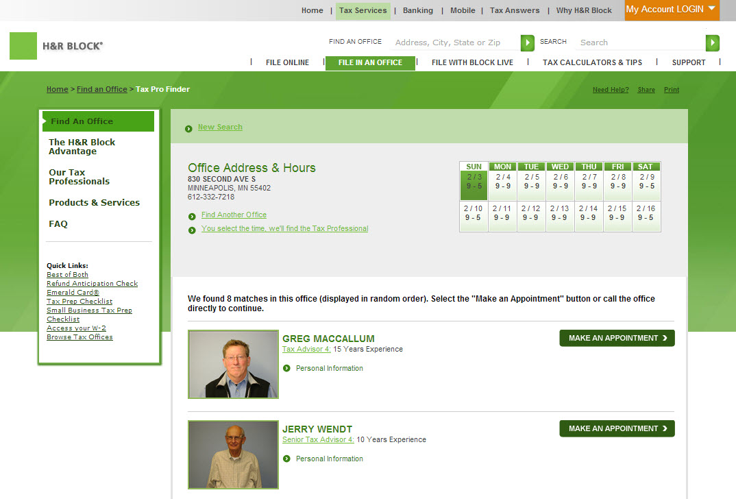
Two companies that I think do this very well are H&R Block and Ameriprise Financial. On H&R’s website, there is a big “Make an Appointment” button next to each tax professional.

H&R Block

I especially love the Ameriprise example because it capitalizes on the most powerful criteria: my personal network. After you connect your Linkedin to Ameriprise, the website recommends financial advisers based on your shared professional connections. Detailed bio information, including published articles, professional credentials, customer satisfaction scores and the adviser’s photo, quickly build trust.

Ameriprise Financial & LinkedIn

Share this post:
    

What to Learn from Disney’s Relationship Marketing Mistakes

I am a huge fan of product finder tools — interactive experiences that ask prospects to assess their current situation or prioritize the features or benefits that are most important to them.

Product finders are a smart way to simplify complex products and services, provide superior customer experience on your website and allow your company to begin relationship marketing using a transparent, user-centric approach.

As you can imagine, planning a Disney vacation is the perfect application for such a tool. Trying to consume everything a family might do at a Disney theme park would be overwhelming and frustrating for most people.

So how did Disney solve this dilemma? I’ll get back to that in just a second.

Relationship Marketing Begins with Helping Customers

Think about the last time you researched a digital camera online. There were hundreds of options, right?

Even after you narrowed your options by price and brand, you were likely presented with way too many choices, with too few discrete differences.

A good digital camera finder tool would ask you how you plan to use your camera, where, how often, and your level of photography expertise, and then recommend 2 or 3 cameras based on those criteria.

Much like a good sales person in a brick-and-mortar store.

Relationship Marketing Tool: Product Finders

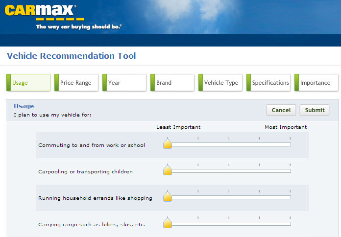
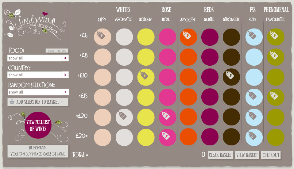
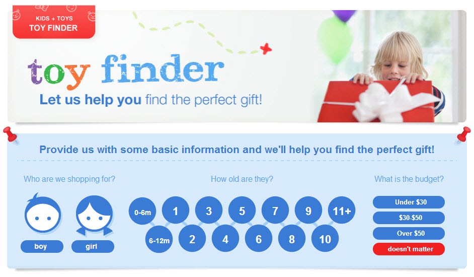
Still need a visual? Here are a few examples of product finders from CarMax, Find Wine and Sears:

CarMax

Find Wine

Sears

Disney Vacation Planning Tool: Before

Now I’m going to pick on Disney for a moment, the much-lauded leader in customer experience design.

When I visited their website last fall to begin preliminary research about Disney World, I was disappointed by what I found. Immediate information overload.

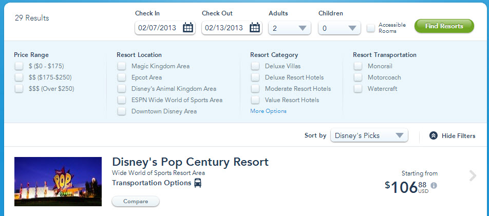
Disney Hotels

29 hotels. No way to compare. No way to filter.

I had to read each and every hotel description and park activity to determine which ones were best for my family. Then I had to try to remember everything I read.

I didn’t visit their website again for 5 months.

Disney Vacation Planning Tool: After

Upon returning the other day, I noticed right away Disney World had relaunched their website.

They still have 29 hotels displayed in a list format, but they wisely introduced the concepts of filtering and comparing. (Though, I think the new format still needs some work. The filter options don’t seem to be aligned with customers’ needs. For example, users can filter by “Moderate Resort Hotels.” What does that mean? How is that different from “Price Range?”)
Disney Hotels

Since last fall, I’ve been thinking Disney badly needs to launch a comprehensive interactive vacation planning tool and relationship marketing program. Even the best filtering options will only get customers so far.

Last year, I spent hours and hours on their website, but Disney never knew I was there.

It would have been great to design my dream Disney vacation; save it to my Disney account; receive emails about insider tips, recommended itineraries, and packing checklists; connect with a Disney World rep; and then later, receive promotional offers. All perfectly timed based on my trip date and recent site activity.

It’s Disney! I want the — ahem — top-notch treatment!

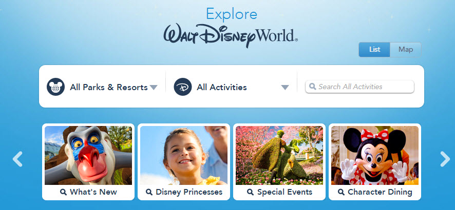
With the recent site redesign, Disney launched something called “My Disney Experience.” Unfortunately, it’s hidden behind a login and buried in the footer, so only the most determined customers will find and access it.

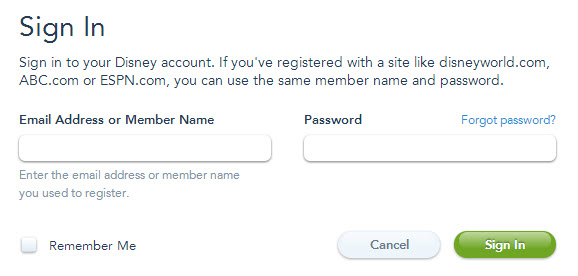
Disney Account Registration
As a highly motivated customer (and to show it to you here), I spent several minutes completing the account registration process in order to view and create “My Disney Experience.” Again, all but the strongest would have walked away at this point. You see, it took me 7 tries – SEVEN! – before I was able to successfully create an account.

Disney World

At first glance, the user interface has all the visual indicators of being exactly what I dreamed an interactive Disney vacation planner would be. But it turns out the planning “tool” is really just more information to read — the personalized recommendation engine I imagined doesn’t exist.

In addition, it looks like information is organized by the way Disney thinks about their company (e.g., which park do I want to attend), rather than the way visitors think (e.g., by specific activity such as meet Mickey Mouse).

At minimum, I wish there was a way to save or remove activities from the itinerary.

Building a Product Finder Tool: Where to Begin

My advice to Disney and companies that are thinking about building a product finder tool is to begin with careful user research to ensure the end result meets your customers’ real needs.

If you haven’t already done so, develop a data-based user persona and customer journey map. These resources will make the rest of the process go much more smoothly.

During the user research phase, ask questions such as:

  • What process did you use to make your decision?
  • Who was involved in your decision process?
  • How did you conduct your research? Walk me through it.
  • What questions did you have?

During the design and development phase, ensure the product finder is built in a scalable and flexible way. Nothing is worse than building a tool that immediately becomes outdated because the technology or algorithm is too complex to ever be touched again. If the technology is getting in the way and causing the project to stall, it’s time to think outside the box. Can you build a much simpler version to start, or even design a pretty matrix that allows customers to compare features or benefits side by side?

As I mention earlier, I think a product finder tool is a great way to begin relationship marketing. Don’t put up roadblocks by asking prospects to register before they can use the tool. (Users won’t do it.) Collect personal data later when you ask customers to save their work, share the results, sign up for e-training, or compare the results with industry benchmarks.

Finally, match up your customer journey map and product finder insights with your offline sales operations. Knowing what information is most critical to prospects — and when — can help drive more relevant, more effective interactions.

For more food for thought, check out this interesting blog post about Starbucks’ approach to relationship marketing. The article includes specific tactics Starbucks uses to gather meaningful information about customers — by talking with them, not at them.

Related Articles

How to Engage Your Users: Location-Aware Experiences

Whenever I talked about location-aware technology to clients, Olive Garden was always my go-to website to demo how this feature works. Today, I was disappointed to find that this feature no longer has a prominent call-out on its home page, and is now buried on the “Find a Restaurant” page.

Boo.

Before I go too much further, let’s get a definition on the table. In a word, location-aware technology is not IP address tracking. It’s much more sophisticated and accurate than that. According to TechTarget, location-aware technology is “… determined by one of three methods: by GPS satellite tracking, by cellular tower triangulation, or by the device’s media access control address on a Wi-Fi network.”

It’s immediately obvious why location-aware technology is fundamental to most mobile browsing experiences, but I also like to encourage clients to think about it for their desktop sites, too.

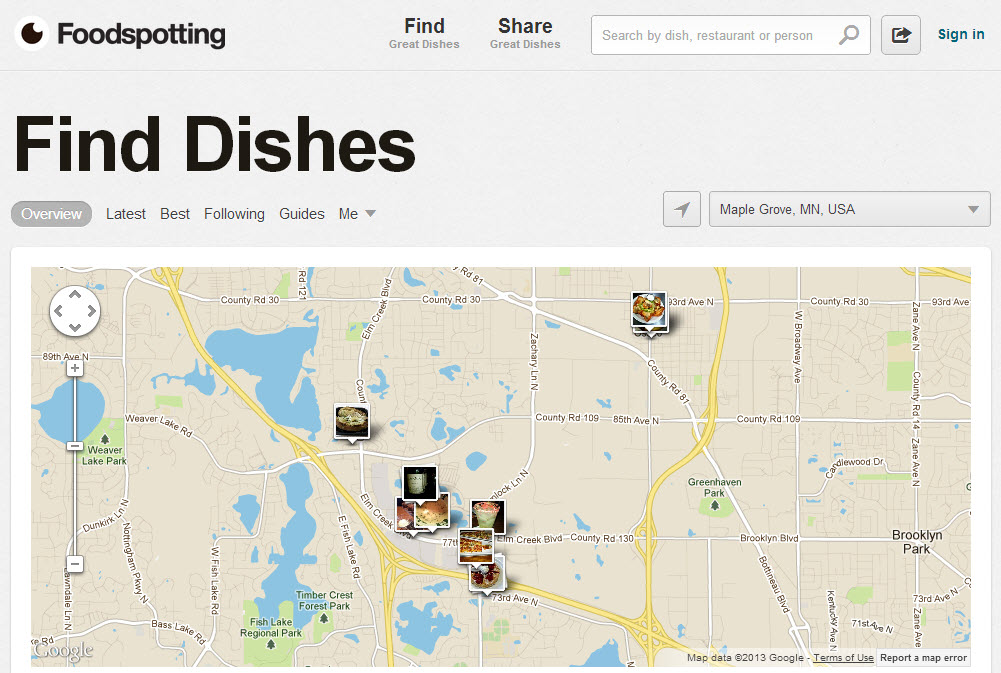
As you can see below, Foodspotting automatically figured out which Minneapolis suburb I live in, and showed me photos of food from nearby restaurants. This is a smart application of the technology. I often conduct my restaurant research on my laptop before I leave the house – not while I’m already driving.

foodspotting website

If you’re a multi-location retailer, restaurant or an international company, I think location-aware technology is a must-have for your website. Instead of asking users to select a country or ZIP code first, connect them to the right location off the bat and deliver targeted content and promotions.

Other creative uses:

  • Showcasing where your product or service is in use (e.g., customers snap photos of their purchase and upload them to your website, Redbox locations).
  • Connecting members of your community (e.g., cancer survivors, tax accountants)
  • Promoting your city or special interest (e.g., local events, coffeeshops)

What’s your favorite location-aware website?

Share this post:
    

How to Create More Engaging Forms

In the world of lead generation, forms are a necessary evil. But there is no need for them to be dreary.

It’s time to put some fun into your forms. Yes, fun!

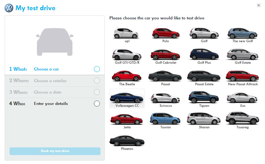
Volkswagen could have easily listed every one of their vehicle models in a drop-down menu. But they didn’t. Instead they displayed every model as a thumbnail image. That’s a little more fun, right?

Volkswagen

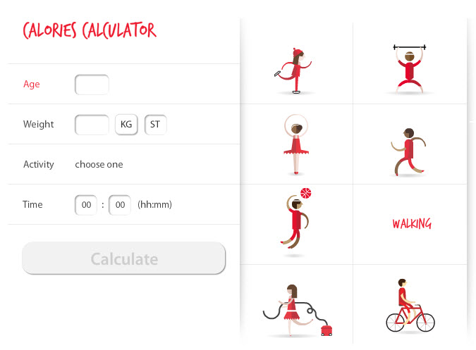
The British Heart Foundation took it a step further than Volkswagen, and created a cute little animation for each activity.

British Heart FoundationOther ways to de-drab your forms:

  • Sliders
  • Calendar pickers
  • Maps
  • Fun facts / educational tips
  • A competition (post a time clock and the average form completion time)

Share this post:
    

5 Ways to Improve Car Manufacturer Website Usability

For all their advancement in car safety, technology, design, and ability to make humorous commercials, car manufacturers have completely stalled when it comes to creating user-centered websites.

Buying a Car Online: Not Fun

Buying a brand new car was not as much fun as I thought it would be. In fact, it was decidedly un-fun.

A few years ago, I set out to buy a Toyota Prius: the perfect car for my family’s lifestyle. Roomy interior for our long legs, hatchback for transporting our black Labrador to the park, and best of all, a hybrid for our environment-friendly way of life.

But then those terrible stories started coming out about Toyota’s accelerator problems, and I found myself at square one. Where to begin my search for a new car? I had no idea.

Where’s the GPS on this Website?

I pay little attention to car commercials (unless they’re playing during the Super Bowl and also are funny). Like many other Americans, I also pay little attention to cars in general. I get in, I drive, I put in gas and occasionally go to the service station when the little red light tells me to.

No such assistance exists on car manufacturer websites. I looked at more than a dozen sites, and they are all organized in the same way: by model.

I immediately went to Google in search of car review sites to help me, but alas, they were structured in the same way: everything I have ever wanted to know about one particular car — no matrices, no side-by-side comparisons.

This was going to take me forever.


BMW: 1, 3, 5, X6… what do these number mean?
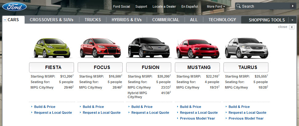

Ford: Why do the prices go up, but gas mileage and seating capacity does not?


Lexus: All those letters make me feel stupid. AWD, RWD, LS, GS?

Toyota: I have no idea where to begin, so I guess I need to look at them all. And don’t be fooled by that “Build Your Toyota” button. First question I am asked: pick your model.

Cars Are Like Jeans

My chief concern in choosing our next family car was fit.

  • Will my long legs fit?
  • Will my husband’s even longer legs fit?
  • Will my poor children be squished to death in the backseat as a result of all this glorious legroom?
  • Will my puppy fit?
  • How many suitcases will fit?
  • How many grocery bags will fit? (Not that I do any grocery shopping myself, but hey, nice to know.)

I looked, but I didn’t find a single dressing room on any car website.

Trunk capacity is given in cubic feet.

Information about legroom is non-existent.

Guess what? Free time on weekends also is non-existent to be test driving and “trying on” cars in person. Moreover, carting 2 kids and their car seats to multiple dealerships… you see where this sentence is headed.

Start with Customers, not Cars

In the user experience (UX) industry, we follow a simple mantra: user-centered design. We watch how people use things, and then design experiences that match their habits, preferences, and goals.

It should come as no surprise — aligning business goals with user needs does wonderful things for a company’s bottom line.

5 UX Prescriptions for Car Manufacturer Websites

1) Online Test Drive

One-third of American adults are obese today. Save them — and tall consumers like myself and my husband — disappointment by helping them find vehicles they will fit into, in the privacy of their own homes. And really, a virtual test drive that can accommodate people of all sizes and shapes would be ideal and much appreciated.

2) Family First

Put children’s needs and comfort at the forefront. Help parents plan for their growing family by organizing vehicles by family-friendly features, such as backseat safety, LATCH systems, built-in car seats, accommodations for smaller frame drivers, and ever-growing arms and legs in the backseat.

3) It’s a Lifestyle Choice

Organize vehicles by how they will be used: towing boats, daily commuting, hauling 8 to 10 bags of groceries, carpooling to school, or a combination of all of the above.

Find out what size vehicle, engine power, interior capacity, etc. is needed by asking in relevant terms. Price, gas mileage, and looks all come secondary if a vehicle cannot meet a customer’s basic needs.

4) A Few Good Features

Find out which features are most important, and then call special attention to them with simple highlighting, videos, illustrations, and interactive tools.

Car manufacturers list so many interior and exterior features, customers’ eyes likely glaze over. Realistically, most people will only care about a handful of features. Help them prioritize.

5) Connect the Dots

Show everyday objects that users can put into a virtual trunk to see how they fit (e.g., suitcases, grocery bags) with an interactive tool such as drag ‘n’ drop. Showing trunk capacity in terms of the number of cubic feet is meaningless to most people. Instead, give customers context. Trunk size is very important. It’s puzzling why so little attention is given to this part of a car.

Unlock the Possibilities

Asking a few qualifying questions upfront about a customer’s needs can go a long way toward creating a delightful online experience.

This approach also allows customers to feel listened to, valued, in control, and engaged. Further, car companies build trust and create unforced opportunities for in-depth education (AKA upselling and brand building).

Been in the market for a new car recently? How would you like to see car websites reorganized and redesigned?

P.S. In the end, we did end up buying a Prius and happily have had zero issues. For the first time in my life, I have to pull the seat forward in order to reach the gas pedal! And the little ones in the back have ample room as well. I brought a tape measure to my test drive to ensure we would all fit comfortably. Puppy, too.

Zip, zip.

Share this post:
    

10 Ways to Amp Up Your Content

When you think of “web content” do you immediately think of paragraphs of text? I’m guilty of this, too.

Content in the form of text is a great way to provide information, but it’s not always the most user-friendly or approachable. It has one major drawback — you actually have to read it to understand it.

Web content can come in many formats: text, photos, illustrations, charts, videos, podcasts, webinars and so on. But don’t limit yourself to just 1 or 2. Having a variety of content styles on your website ensures that you connect with a variety of learning styles. Not everyone has time to read. Not everyone watches video online.

Luckily, there are content formats almost everyone loves:

  • BIG fonts
  • short phrases
  • pretty pictures
If your website has only text and photos today, take a second look to see if any of your content could be converted into a diagram, illustration, video demonstration or another, more visual format. Here are 10 ideas to get you started.

1. Put bullet points center stage

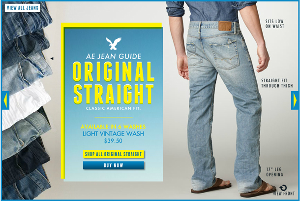
If you are one of my clients… I apologize for showing this to you again. For the rest of you, I love this ultra-simple approach that American Eagle takes in its Jeans Guide: just a product name, price, big photos and bullet points shown in context to the product.

This page is chock full of information, but you don’t even notice that you’re reading.

visual content - photos and bullet points

2. Show important information sooner

Rather than waiting until the deepest pages of your website to share pricing, product specifications and shipping costs – give this detail greater prominence by showing it on the home page and directory pages.

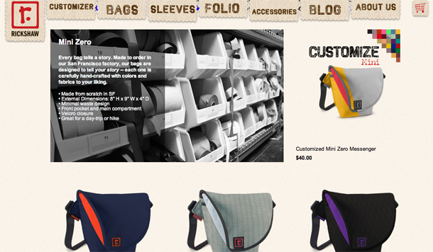
In this example from Rickshaw Bags, rather than waiting to show critical information on the product page, they list common product information on the product directory page complemented by a “behind-the-scenes” photo. Telling the product story sooner engages customers sooner. (They actually show the product information on both the directory and product detail pages, which is the safest bet.)

shared content

3. Show a side-by-side comparison

Comparison charts are a great way to talk about your product / service quickly and show (not tell) why yours is superior. You don’t necessarily need to show your product / service against a direct competitor – compare yourself to the entire category. If your product or service is innovative, cutting-edge or eco, then go up against the gorilla in your industry.

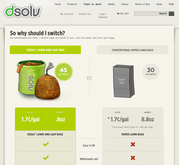
Dsolv quickly demonstrates how their bags are superior to traditional paper lawn bags.

visual content, comparison chart

4. Teach your customers how to use your product

While learning how to use your product or service, customers will also learn about its benefits, build confidence and gain a deeper understanding than if they had just read about its features and benefits.

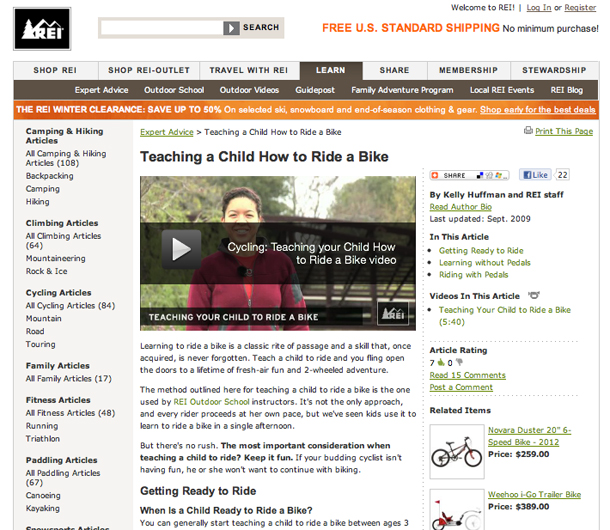
REI developed a series of informative videos to complement their step-by-step guides. Below, REI helps parents teach their children how to ride a bike.

visual content, educational video

5. Show how it’s made

Add a layer of storytelling to your site by showing an inside look into your company. You don’t have to give away any trade secrets or formulas, but can you show your raw materials? Your employees carefully packing products? Employees testing them for quality assurance?

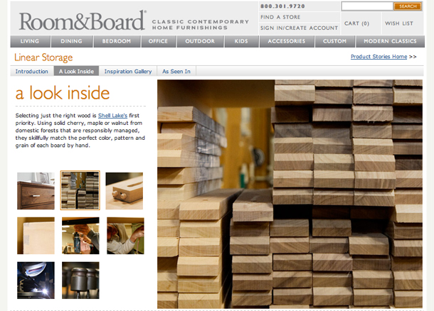
Room & Board gives a behind-the-scenes look at their products.
visual content - how it's made

6. Show your product in use

Show your product in context. If you are a car manufacturer, show the vehicle with different sizes of people – small, medium and large – sitting behind the wheel. If you sell toys, create a video showing children playing with your product.

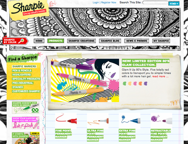
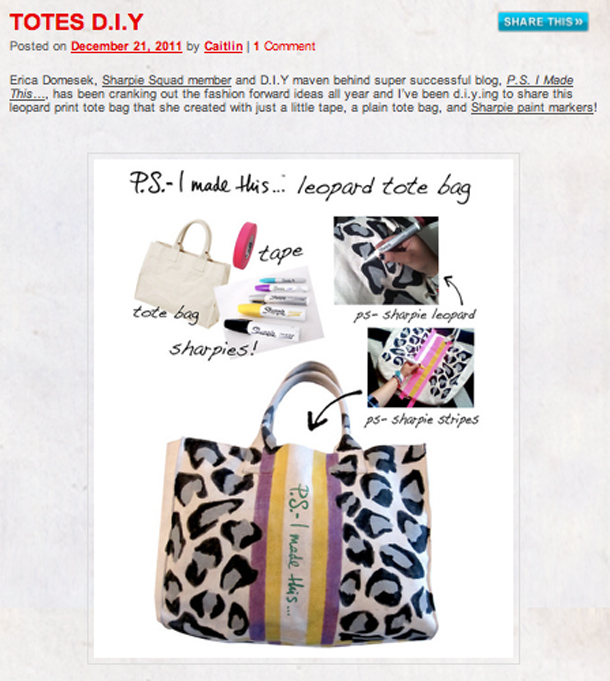
Sharpie could have easily shown just photos of their markers on this page and listed the thickness in the description. But they didn’t. They went one step further and SHOWED the thickness.

7. Show how customers use your product

You can either list some ways to use your product, or customers can show how they use your product. Their way will likely be more interesting than yours.

Sharpie has an amazing site filled with all sorts of great content. Here, their blog is filled with customer photos showing off their Sharpie creations.

8. Show your product in context

Show how your product coordinates with items your customers already have. Show how your product will fit into their lives.

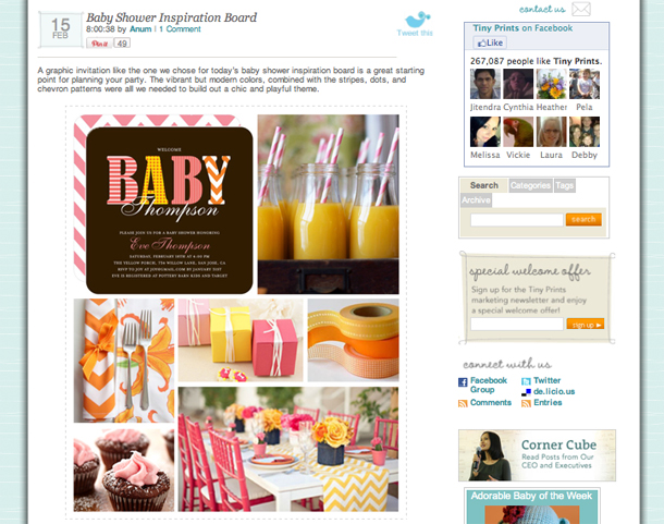
Tiny Prints picked one of their cute baby shower invitations, then built an entire party around it.
visual content, mood board

9. Have customers explain why your product is awesome

Reviews are a great way to build trust and create rich content. On the downside, they can be difficult to obtain. In reality, most people don’t write reviews. (Amazon gives false hope that reviews are easy to get.)

Testimonials are another (and easier) way to show customer feedback. To build trust and authenticity, reveal as much about the customer’s identity as they are comfortable with: their first and last name, organization / title, photo, audio and/or video. Some prospects may be leery of fake or paid testimonials, so do what you can to combat this jaded point of view.

Testimonials can be captured via e-mail, letters, recorded / transcribed phone calls, Skype or a professional video shoot.

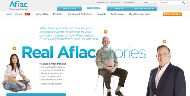
These Aflac videos are some of the most powerful I have ever watched.

visual content, video testomonials

10. Make your content fun

Be creative. Information doesn’t always need to be presented in a serious manner.

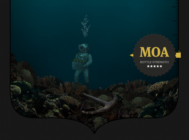
This example from MOA Beer doesn’t provide any real information about its product, but its fun, interactive approach contrasts their product with competitors and shows off their brand personality. (As the web user scrolls down the page, an underwater diver sinks to the bottom of the ocean — revealing content about their and competitors’ “bottle strength” along the way.)

visual content

6 Tips for Creating Useful, Usable Content

  1. Branding – When creating visual content, brand it with your logo and colors. Tiny Prints is missing a big branding opportunity when its baby shower party image gets tagged on Pinterest.
  2. Accessibility-Friendly – If you’re using dynamic content or Flash to create a visual, ensure that the content doesn’t “break” when it’s resized or images are turned off. When I resized AE’s Jean Guide, the information about the jeans was lost.
  3. Social-Friendly – Ensure your video content (and all your public-facing content) can be easily bookmarked, e-mailed, pinned and tweeted. In the case of Aflac, all of its beautiful videos are embedded into the site and cannot be shared. Providing alternate links to YouTube or Vimeo would help solve this.
  4. Readable – When using color in your graphics, ensure they are high contrast. Dsolv’s comparison chart coincides with its neon green branding, but it is difficult to read. Similarly, Rickshaw uses white text on top of a black & white photograph, compromising readability.
  5. Meaningful – Keep the big picture in mind when demonstrating context. In the case of Sharpie, it’s not exactly clear which marker is the thinnest marker – extra fine or ultra fine? Adding the width in the product name would help clarify this (e.g., 0.3 MM).
  6. Mobile-Friendly – All of the examples here passed my iPad test (with either the same or altered experience), and it’s something for you to keep in mind, too. Use your website analytics to determine which browsers and browser sizes you need to be testing your site on.

Stumble across any content lately that you thought was presented in an innovative way? Please share!

Related Articles

UX Word of the Day: Content Chunking

Steal These Mobile-First Content Patterns

Happy Birthday to June UX: One Year Old!

My little company, June UX, is turning one! Never has a year gone by so fast.

Here is a recap of how it began, what I did, who I met and what I plan to do next.

Why I Did It

Being independent has been exactly what I dreamt it would be: a healthy balance between work, family and me-time – and best of all, I’m finally living guilt-free. (Other moms know what I mean.)

The No. 1 driving force behind my decision to go independent last February was my family. I constantly felt like I was letting them down, but neither did I feel like I was giving 100% focus to my job. “Me” time? I didn’t even know what that was.

Starting my own business has been food for my soul.

Brand Identity

early versions of June UX logo

People often ask me about the story behind “June UX” and how I came up with the name.

I began with the tagline: happy user experiences. (It’s what I make!) From there, I daydreamed about the things that made me the most happy. As a Minnesotan – where it’s winter 6 months out of the year – summer easily tops the list of things that make ALL of us here happy. After staring at a bunch of summer-y words awhile, something about “June” felt right to me.

The “UX” part was easy… In my field, user experience is commonly abbreviated as UX.

Mari Richards of MR Design developed the logo. [Early logo development above.]

Equipment & Supplies

June UX laptop bag contents

I didn’t purchase everything you see here at once, but the majority was picked up right away. There definitely were several trips to Apple and Best Buy in those first few weeks.

  • MacBook Pro – I honestly wanted to get a PC laptop for my business, but the reviews varied so wildly from fantastic to lemon that Apple soon became the only option I had confidence in. As an Apple-owner for the past 25+ years, I figured I’d have no trouble being my own tech-support.
  • Router – Having wireless access to the Internet has been life-altering. (It’s 2012, why isn’t wireless Internet accessible from every corner of the globe?)
  • Windows – Operating system for Mac. For me, Visio is a personal must. So in order to use it, I had to essentially split my MacBook into 2 hard drives.
  • VisioWireframing tool (PC only). I’ve been using Visio for more than 4 years now and personally think it’s the most comprehensive and most flexible of the diagraming tools. One of my favorite features is the ability to bring in images & crop them right there.
  • Microsoft Office – I use PowerPoint and Excel routinely for presentations and analysis, Word to create worksheets and other tools, and Outlook for e-mail and scheduling, of course.
  • Photoshop ElementsPhoto and image editor. To be able to edit PSD files and optimize graphics for the Web ; used mostly for maintaining my own site. It’s missing some features I adore from the full-version, but it does the job.
  • OmnigraffleWireframing tool (Mac only). Only used when required by a client.
  • SnagItScreen capture tool. I take thousands of screen captures, so having a good tool saves me time and headaches. The only thing it doesn’t do well is capture scrolling PDF documents.
  • VGA AdapterConnects MacBook to projectors.
  • WordPress & Genesis ThemeBlogging platform and WordPress skin. I’m still a newbie with a lot to learn, but I was very surprised at the steep learning curve of WordPress. I’ll share what I learned the hard way in a future blog topic.
  • Sony DSLRDigital camera. For taking photos of artifacts and research participants.
  • Business cards – Ordered from Vistaprint, the cheapest online printer I could find. Fancy cards will have to come later.
  • Professional headshotMaris Ehlers Photography. I wish I had known Maris when I had gotten married so she could have photographed my wedding portraits also.
  • Moleskine notebooks – For taking notes during client meetings. I bought them because everyone on Twitter raved about them; now I think they were all paid spokespeople. I don’t “get” the passion people have for Moleskine. Please explain it to me.
  • Whiteboard – Keeping everything organized in Outlook and my own calendar system quickly became overwhelming. Having an at-a-glance resource center has made a huge difference in my sanity.
  • Web hostingAplus.net, recently bought out by Deluxe. I’ve been using Aplus for almost 7 years for my other websites, and like them a lot. Their tools are easy to use and their customer support is amazing.
  • Lawyer fees – I became an official LLC in October 2011.
  • Markers – Used for sketching ideas during client meetings. I bought fine-point Sharpie markers, plus some thick artist-quality markers in black, gray and yellow.
  • Roll of white paper – Used for sketching during client meetings. IKEA sells them for 5 bucks.

Notable Books

I read a lot of business and marketing books last year (as I do every year), but just these 3 stood out for me. I will write a future post about the best business books I’ve read over the past 15 years. (Most life-changing: Now, Discover Your Strengths by Marcus Buckingham & Donald O Clifton.)

  • Content Rules by Ann Handley & CC Chapman. I have recommended this book to all of my clients. I’ve read numerous books about content and content strategy and can honestly say, if you only buy one book about content – this is the one.
  • Measuring the User Experience by Tom Tullis & Bill Albert. There are tons and tons of books and blog posts about conducting usability studies, but none of them go into great detail about the analysis phase. This book is 100% devoted to it. It validated many of my approaches, plus gave me ideas on more ways to dissect usability data.
  • The Art of the Start by Guy Kawasaki. I enjoyed his advice about hiring employees, and will be sure to reread that chapter when I get ready to hire my first employee.

Projects & Clients

When I looked back at my invoices, I was surprised to discover that I worked with 7 clients on 17 different projects. (No wonder I was up working until 2am a lot!)

  • User Research & Strategy Projects: 3
  • User Experience Design Projects: 6
  • Usability Testing Projects: 6
  • Copywriting Projects: 2

Thank YOU

Thank you to everyone who supported and believed in me – there are many, many of you. Thank you for your friendship, your partnership, your business and your word-of-mouth marketing on my behalf. Most of all, I thank my husband. He never once questioned or showed the least bit of apprehension about our life-changing decision.

Related Articles

June UX Is 5 Years Old
How I Find Work as a Freelance UX

Confusing, Incomplete Content Creates the Most Usability Issues

If you haven’t witnessed a usability study before, you may have wondered what types of issues test participants find, and how many issues they typically uncover. 5 issues? 50 issues? 500 issues? Gulp.

Of the 100+ issues I uncover in a typical usability study, more than one-third are content-related.

Types of Usability Issues

I conducted my first usability study in 2006. I asked someone in the IT department to haul an extra PC into an empty conference room for me, then I recruited 6 or so participants via our customer database. It was about as unsophisticated as you could get — no recording software, no observers. It was just the participant and me (taking frantic notes).

Since then, I’ve conducted more than 400 usability test sessions — in formal labs, not-so-formal labs, in coffee shops, remotely and even guerilla-style (where I ambushed some willing moms at the mall).

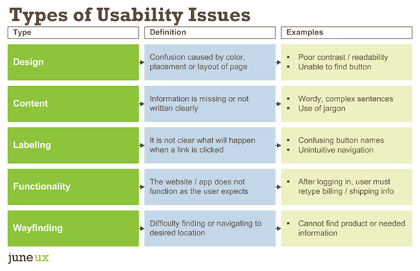
When collecting usability study findings, I usually classify them into 1 of 5 categories: design, content, labeling, functionality and wayfinding. Depending on the type of project, there might be a 6th category, such as merchandising for an e-commerce site.

Types of Usability Issues

I think it’s a good idea to classify usability issues because this extra step can help make divvying up the workload after the study easier. For example:

Divy Up Usability Issues

Categorizing usability issues also helps the project team more easily understand how to solve the issue.

For example, if a user cannot find the “Continue” button — is it because of the button label or because the button is located in an unexpected place on the page? As the facilitator, I know that test participants did not scroll down on the page far enough to see the button. Categorizing this finding as a “design” issue, rather than as a “labeling” issue helps ensure the team solves the right problem.

Usability Results: By the Numbers

Disclaimer: The following represents my own experience. Your results may vary.

To answer my earlier question about which type of usability issue is most common, I pulled out the findings from 10 recent usability studies. The following data comes from 8 websites and 2 web applications from various organizations.

There were 5 to 8 participants per study, but most had 8 participants. All 74 usability test sessions were 1 hour in length and included anywhere from 5 to 8 tasks per session.

On average, each study revealed 113 usability issues. The studies uncovered as few as 67 issues and as many as 178. In total, 74 test participants found 1,126 usability issues across 10 websites and apps.

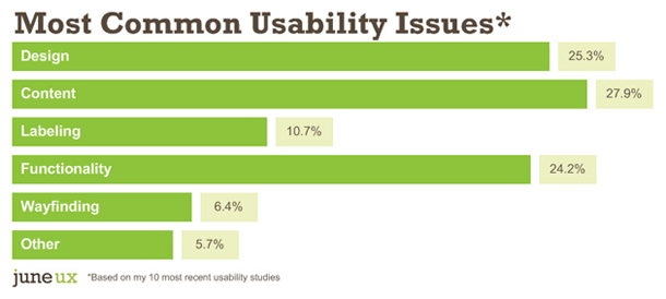
And so without further ado, here were my findings:

Common Usability Issues

Together, content and labeling issues made up 38.6% of the total usability issues on these 10 sites.

We’ve heard it a million times: content is king. However, I like to put it another way: content is the user experience.

Often user experience isn’t about navigation or drop-down menus and radio buttons. A website can be flawless functionally and visually, but if the information users expect isn’t there or they don’t understand it, nothing else matters.

The great news about finding content usability issues is that they are the least expensive type of issue to fix — little to no developer time is involved. Of the 5, wayfinding is potentially the most expensive. If people cannot find their way to critical information, something is fundamentally broken.

Apply My Findings to Your Next Usability Study

So now that I did all this analysis… what is the big takeaway?

I am a huge fan of prototype testing. Usability testing wireframes – or even hand-drawn sketches – saves a ton of money vs. waiting until everything is coded and “perfect.” But here is where I would use caution when prototype testing…

Use real content in prototypes

Since content is such a huge part of the user experience (and number of usability problems), I implore you to use as much real content in your prototype as possible.

Lorem ipsum (AKA placeholder text) might be passable for wireframes, but absolutely not for prototypes.

Test participants almost always inquire about greek text — “what is that, what language is that, I can’t read that” — and you end up wasting valuable time telling them to ignore it.

Hire a writer who specializes in web writing

If you haven’t done so already, hire a web copywriter to write content for your prototypes and make sure they — plus the design and development teams — observe all of the usability test sessions.

Test, then test again

Early prototypes also will likely lack design elements, such as color and information hierarchy — so it is critical to test again during the design phase. But I wouldn’t wait until the design is complete to test it for the first time. Testing early may yield brand-new ideas, increase scope, decrease scope or even confirm that you are on exactly the right path.

Happy testing!

Related Articles

UX Word of the Day: Content Chunking
The 5-Step Process I Use to Plan + Conduct Usability Studies
Steal These Mobile-First Content Patterns

Cutting Out User Research Costs You Money

User research (that is, talking one-on-one with your target audience) ensures that your website requirements are aligned with your customers’ needs. In the long-run, user research saves time, reduces revisions and second-guessing, uncovers lost revenue opportunities and identifies wasted resources.

It’s easy to fall into the trap of doing things because your competitors do them. Further, you run the risk of squandering money on web features your customers don’t want or need.

By conducting user research, you will find out if it’s worth the sweat and tears of publishing a blog, or if Twitter would be a better investment of your time. You’ll find out if your customers ever attend webinars or read papers and why. Or what keeps prospects from purchasing or signing up.

Declining to conduct user research (and ideally, a competitive analysis, too) breaks the system of checks and balances. Without conflict or corroboration between information sources — there is no confidence, no prioritization, no red flags, no focus.

How to: Create a Cookie-Cutter Web Strategy

I was once in a very uncomfortable situation where a client told me that my ideas were boring. I admit, she was right. After looking at their website and reviewing my client interview notes, I wrote down some ways the client could improve their site. They were common best practices found on many B2B websites: add a blog and papers, include customer testimonials, organize the portfolio by industry and so forth. I offered few unique approaches or fresh ideas.

Did I have confidence this was even the right strategy? Not really. But with the limited knowledge I had about this company, it was the best I had to offer. But I also knew it was not the caliber of work I was used to delivering to clients.

So what was different about this project?

Before the project was assigned to me, the client cut user research and the competitive analysis from the budget — tasks I had always conducted for other clients. Now, the discovery phase included just one meeting with the client team. After the meeting, I understood more about the company — but still only at a 10,000-foot level. So guess what happened? Because I never got to ground-level, I delivered a 10,000-foot web strategy. Mediocre input yielded mediocre output.

It’s very difficult to spot “aha” moments at the 10,000-foot level. Sometimes you can easily spot them. And sometimes the light bulb doesn’t turn on until the second or third time you see them.

Finding “aha” moments during user research can mean:

  • finding simple ways to delight your customers
  • lowering the abandonment rate
  • realigning the messaging to be more relevant
  • introducing a value-add service
  • clarifying pricing and benefits
  • reducing call center volume or talk time
  • hundreds, thousands or even millions in incremental revenue

How-to: Create an Insights-Driven Web Strategy

During a typical discovery phase, the web strategist will likely ask about your business, your competitors and your customers – who they are, about their background, what challenges they face, what information they need, why they visit your site and so on. The customer part of the discussion usually lasts 15 minutes to an hour.

All of this information about your customers is invaluable. But it should only be a jumping off point to a larger study about your customers. Nothing can replace talking to your customers one-on-one.

To do our jobs to the best of our ability, web strategists need to hear from your customers first-hand:

  • their personal anecdotes
  • the words they use to describe your products and services
  • their attitudes
  • who and what influences their decisions
  • their questions and concerns
  • why they chose you and not a competitor
  • what they worry about
  • where they access your site (at a desk or on the road)
  • what other sites they visit and why

User research – in the form of surveys, interviews, focus groups, usability studies – sets up your entire project for success. User research doesn’t need to be complex or expensive. In many cases, the findings that are uncovered will pay for themselves within days, weeks or months of launching. If after conducting research, you find that you don’t learn anything new — well, isn’t that good to know also? Validation is actually the best possible outcome: no scope creep (yay!).

Don’t wait until your next redesign to begin conducting user research. Set up an informal focus group at your office or at an upcoming trade show. Send out a short online survey to 10% of your database. Watch a handful of customers use your website. Set up a poll on Facebook or tweet questions to your followers on Twitter. Listen in on customer service or sales calls.

6 Ways I Would Improve the Usability of Etsy

UPDATE: I launched a shop on Etsy about 2 weeks after this post was published. A lot has changed on Etsy since this post was first written in 2012.

I first discovered Etsy in 2006 and was immediately addicted despite my poor success rate of finding anything I actually wanted to buy.

Here was my typical experience: search, surf awhile, refine my search, surf for awhile, refine my search again, surf for a few more minutes, and then finally hopelessly give up at 1 o’ clock in the morning.

Fast forward 6 years later and my behavior is pretty much the same, except now I religiously use the “favorite” feature (or pin to Pinterest) because now I know I will never find that same item ever again.

Etsy homepage

If you’re not familiar with Etsy, it is a collection of independent shops who sell (mostly) handmade items such as purses, jewelry, clothing, toys, accessories, furniture, food, and art. Buyers purchase items directly from sellers, and then Etsy collects a small listing fee and commission on each item sold. It has easily turned millions of stay-at-home moms and starving artists into small business owners. (Yay!)

Etsy handmade itemsAs much as I love the concept of Etsy and adore the many items I have purchased over the years, I do not love the user experience. In a word, it is horrible. At present, there are 9.3 million items on Etsy. Yes, that’s right. Nine Million Products. With that many products on a website, search and navigation must be absolutely impeccable.

But it is not.

If I were director of user experience at Etsy, here are 6 ways I would improve the usability of the site.

1. Establish photography standards.

Without a doubt, the poorly lit and fuzzy photography that runs rampant on Etsy negatively impacts the entire user experience. Plus, it puts shops with great photography at an unfair disadvantage. The more bad photographs users must wade through, the less likely they will reach the shop with the great photography and fabulous products. In my experience, shops with great photography tend to have many more sales. (Funny how the 2 are correlated.)

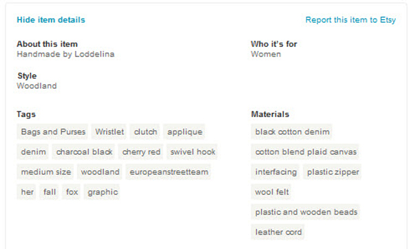
Etsy tags

2. Add filtering.

If you have 8 hours to kill, use the left navigation to shop on Etsy.  Using the site this way means viewing hundreds of thousands of items in each category and tens of thousands of items in each subcategory. The only way to find anything on Etsy is by searching. When you enter a keyword in Etsy, the search engine uses product names and product tags to display items by relevancy.

Shop owners can add up to 13 tags plus up to 13 material tags (e.g., wood, felt). Tags are a fantastic way to add meta data to a website – if done correctly. Unfortunately, Etsy does not standardize tags, rendering them pretty much useless. Let’s pretend a user searches for “aqua diaper backpack,” but unfortunately, the seller tagged the item as “turquoise” and “diaper bag.” Consequently, buyer and seller will never find each other.


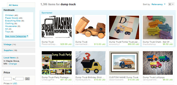
Etsy pagination

3. Eliminate pagination.

Pagination is dead. Or at least I think it should be. Pagination was chiefly invented by publishers as a way to increase page views so that they could make more money on advertising.  Large sites such as Twitter, Google, Linkedin and Facebook are already moving away from pagination.

What do I mean by “pagination?” Instead of viewing 10 items per page, then clicking “next page” to view the next set of 10, users click “show more” and now view all 20 items on the same Web page – making it easier to compare and return to previous items.

Pagination is especially devastating for Etsy. When the number of search results is almost always in the thousands or tens of thousands, viewing 40 items at a time is, well, time-consuming and exasperating.

4. Build a (better) recommendation engine.

If Etsy has a recommendation engine, it’s not at all obvious to me. I have “favorited” hundreds of items and dozens of shops and purchased many items in these past 6 years, and yet Etsy has never shown me relevant products on the home page. Instead I’m shown a group of items curated by an Etsy member, of which rarely match my tastes. Or they show me “items matching my taste” — based on a quiz I took on Etsy — which rarely match my tastes. You see the humor in this, right?

5. Eliminate duplicate categories.

There are multiple ways to browse for toys on Etsy. You can select “Toy” in the left navigation. Or, you can select “Children,” and then “Toys” from the subcategory list. But there are consequences if you choose the wrong path.  You will see two entirely different sets of toys.

Note: The categories are actually helpful when searching on Etsy. You can use them to help filter your search results.

Etsy filtering

6. Display personalized search results.

If Etsy wants to dramatically grow revenue, it is imperative that they build an intelligent search engine. That is, display results based on a combination of factors: past browsing and purchase behavior, popularity (e.g., purchases, views), relevancy of keywords, social media influence (e.g., number of backlinks), and predictive selling.

A smart search engine would eliminate the loophole that allows some shop owners to “game” the system by constantly relisting their items and adding non-relevant tags to their items in order to appear on the first page of search results.

In addition, search results should include “layered” or multiple sets of search listings, then allow users to choose the set that works best for them. Examples of search sets:

  • Regular search listings
  • Most popular items
  • Recently viewed items
  • Editor’s Picks
  • Sponsored items

After poking around on Google for a few minutes, I discovered that Etsy routinely conducts usability studies – which is great news! It is clear that Etsy works hard to support its shop owners in other ways also – with community discussion forums, shop makeover labs, featuring sellers, partnering with West Elm, craft nights, and, of course, an extensive how-to guide for new sellers. It is rare to find a brand that gives so much back to its community. You can’t help but root for such a special company.

Now, your turn. If you were director of user experience at Etsy, what would you change? Tweet me @KristineRemer.