Please steal these content patterns and use them on your website (or email templates). Usability and mobile-first thinking are built into every single one.
Over the past several months, I’ve been thinking a lot about mobile-first content patterns—looking for top-notch examples and sketching ideas on paper.
As a former (current?) journalist and writer, I am extremely passionate about all things content. In judging a website’s usability, one of the first things I always zero in on is how the content is formatted.
- Is the content formatted to be easily read on both a desktop computer and mobile phone?
- Is it scannable?
- It is clear what the content is about—without even reading the copy?
- Is it fatiguing?
- Is content chunked into multiple paragraphs, bullets, or visual content?
Here are a few different content patterns I recently sketched…
Pattern #1: Abstracts with Links
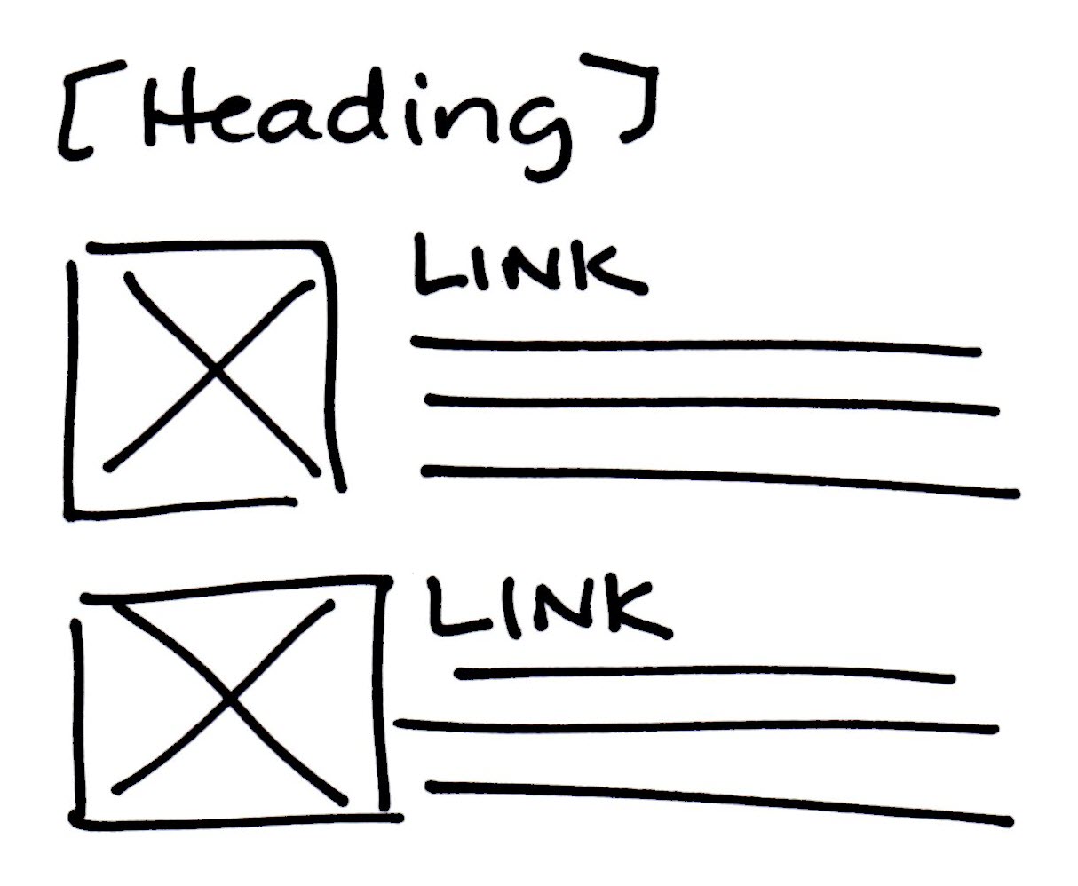
This type of pattern is best used when you want to provide a lot of information quickly, but don’t want the user to get bogged down with several paragraphs of text. The user can easily skim this list to figure out which topics they want to learn more about, then click for more.
Why I like this pattern:
- Heading: Makes it easy to see what the underlying content below will be about.
- Images: Helps shorten the width of the content, reducing reader fatigue. Also: eye candy and clickable-looking content.
- Link as Headers: The links serve dual purpose. They provide more details, but remove unnecessary additional links or buttons below each content block.
Pattern #2: Abstract without Header Link
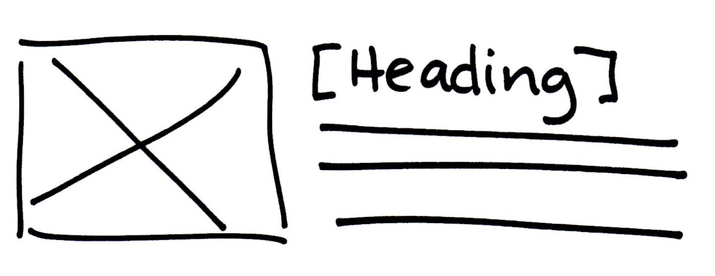
This pattern is just a variation of the one above. Use this pattern when an overarching heading or link to more information isn’t needed.
Pattern #3: 3-Up Features Content Block
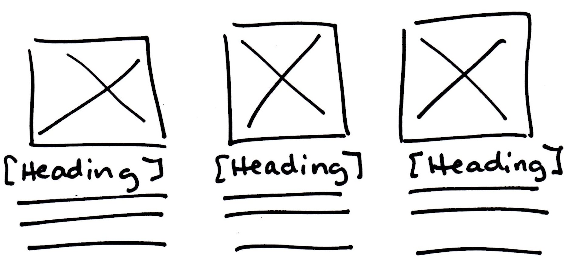
This is a very popular pattern right now. Usually the images are either icons for product features or headshots for testimonials. I really like this pattern because it’s easy to see how it will render on mobile, but also doesn’t sacrifice the experience when viewed on mobile.
In this type of pattern, usually the content below each image is center-aligned. When there are more than a few lines (3 lines maximum, in my opinion), center-aligned body copy is EXTREMELY difficult to read. Ensure your copywriter has strict word count limitations when this pattern is used.
It’s easy to imagine variations of this pattern:
- Headings as links
- Headline above 3-up content group
- No headings
- Second row of 3-up content group
- All the same variations, but for 2-up content groups
Why I like this pattern:
- Headings: Makes it easy to see what the underlying content below will be about. Headings could easily double as links to more information, reducing need for additional button / link clutter.
- Images: Makes content feel more light and airy. Really nice alternative to just treating this same content in a bullet point format.
Pattern #4: 1-Up Content Block with Image
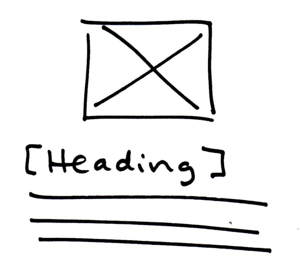
This is one of my favorite patterns, but I believe it should only be implemented in a very specific way.
Full-width content—that is, regular-size body copy that expands the entire width of a desktop website—should be illegal. (Yes, illegal!) It is very difficult and very fatiguing to read content that spans the entire width of a computer screen.
To use this pattern correctly on a desktop website, I believe there should be ample empty space on either side of the column—to ensure the width of the text is narrow enough to read comfortably. Not only will the additional empty space assist in dramatically improving readability, but it will also create laser-like focus.
It’s easy to imagine variations of this pattern, too:
- Heading as link
- No heading
- Image as video player
Why I like this pattern:
- Headings: Built-in scannability.
- Images: Makes content more scannable and memorable. Imagine an entire article where every few paragraphs are broken up with an illustration, icon, photo, or hand-drawn sketch of a content pattern… Those visual breaks give users’ eyes a brief enough rest to help them plow through the next section of content.
In Conclusion
Is scannability part of your proofreading or editing process? Use thoughtful content formatting to ensure your message still gets across — even if your audience doesn’t read every word.
Related Articles
- Experience Is Experience Is Experience
- What Are the Different UX Career Options?
- How to Get Real-World UX Experience without Going Back to School
- Designing for Inclusion & Accessibility: The Giant List of Use Cases
- How Product Management & UX Work Together