When you think of “web content” do you immediately think of paragraphs of text? I’m guilty of this, too.
Content in the form of text is a great way to provide information, but it’s not always the most user-friendly or approachable. It has one major drawback — you actually have to read it to understand it.
Web content can come in many formats: text, photos, illustrations, charts, videos, podcasts, webinars and so on. But don’t limit yourself to just 1 or 2. Having a variety of content styles on your website ensures that you connect with a variety of learning styles. Not everyone has time to read. Not everyone watches video online.
Luckily, there are content formats almost everyone loves:
- BIG fonts
- short phrases
- pretty pictures
1. Put bullet points center stage
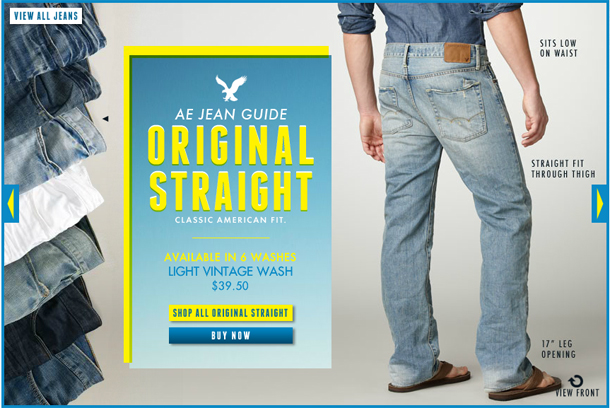
If you are one of my clients… I apologize for showing this to you again. For the rest of you, I love this ultra-simple approach that American Eagle takes in its Jeans Guide: just a product name, price, big photos and bullet points shown in context to the product.
This page is chock full of information, but you don’t even notice that you’re reading.
2. Show important information sooner
Rather than waiting until the deepest pages of your website to share pricing, product specifications and shipping costs – give this detail greater prominence by showing it on the home page and directory pages.
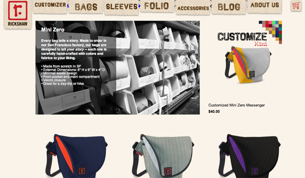
In this example from Rickshaw Bags, rather than waiting to show critical information on the product page, they list common product information on the product directory page complemented by a “behind-the-scenes” photo. Telling the product story sooner engages customers sooner. (They actually show the product information on both the directory and product detail pages, which is the safest bet.)
3. Show a side-by-side comparison
Comparison charts are a great way to talk about your product / service quickly and show (not tell) why yours is superior. You don’t necessarily need to show your product / service against a direct competitor – compare yourself to the entire category. If your product or service is innovative, cutting-edge or eco, then go up against the gorilla in your industry.
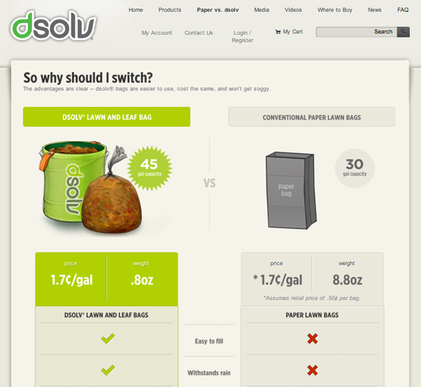
Dsolv quickly demonstrates how their bags are superior to traditional paper lawn bags.
4. Teach your customers how to use your product
While learning how to use your product or service, customers will also learn about its benefits, build confidence and gain a deeper understanding than if they had just read about its features and benefits.
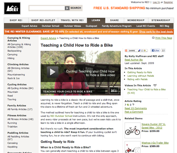
REI developed a series of informative videos to complement their step-by-step guides. Below, REI helps parents teach their children how to ride a bike.
5. Show how it’s made
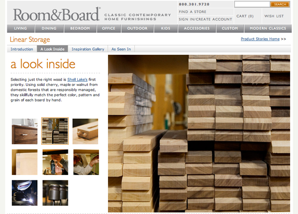
Add a layer of storytelling to your site by showing an inside look into your company. You don’t have to give away any trade secrets or formulas, but can you show your raw materials? Your employees carefully packing products? Employees testing them for quality assurance?
Room & Board gives a behind-the-scenes look at their products.
6. Show your product in use
Show your product in context. If you are a car manufacturer, show the vehicle with different sizes of people – small, medium and large – sitting behind the wheel. If you sell toys, create a video showing children playing with your product.
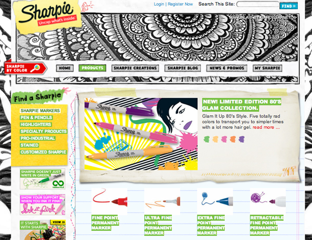
Sharpie could have easily shown just photos of their markers on this page and listed the thickness in the description. But they didn’t. They went one step further and SHOWED the thickness.
7. Show how customers use your product
You can either list some ways to use your product, or customers can show how they use your product. Their way will likely be more interesting than yours.
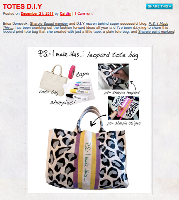
Sharpie has an amazing site filled with all sorts of great content. Here, their blog is filled with customer photos showing off their Sharpie creations.
8. Show your product in context
Show how your product coordinates with items your customers already have. Show how your product will fit into their lives.
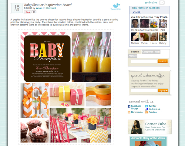
Tiny Prints picked one of their cute baby shower invitations, then built an entire party around it.
9. Have customers explain why your product is awesome
Reviews are a great way to build trust and create rich content. On the downside, they can be difficult to obtain. In reality, most people don’t write reviews. (Amazon gives false hope that reviews are easy to get.)
Testimonials are another (and easier) way to show customer feedback. To build trust and authenticity, reveal as much about the customer’s identity as they are comfortable with: their first and last name, organization / title, photo, audio and/or video. Some prospects may be leery of fake or paid testimonials, so do what you can to combat this jaded point of view.
Testimonials can be captured via e-mail, letters, recorded / transcribed phone calls, Skype or a professional video shoot.
These Aflac videos are some of the most powerful I have ever watched.
10. Make your content fun
Be creative. Information doesn’t always need to be presented in a serious manner.
This example from MOA Beer doesn’t provide any real information about its product, but its fun, interactive approach contrasts their product with competitors and shows off their brand personality. (As the web user scrolls down the page, an underwater diver sinks to the bottom of the ocean — revealing content about their and competitors’ “bottle strength” along the way.)
6 Tips for Creating Useful, Usable Content
- Branding – When creating visual content, brand it with your logo and colors. Tiny Prints is missing a big branding opportunity when its baby shower party image gets tagged on Pinterest.
- Accessibility-Friendly – If you’re using dynamic content or Flash to create a visual, ensure that the content doesn’t “break” when it’s resized or images are turned off. When I resized AE’s Jean Guide, the information about the jeans was lost.
- Social-Friendly – Ensure your video content (and all your public-facing content) can be easily bookmarked, e-mailed, pinned and tweeted. In the case of Aflac, all of its beautiful videos are embedded into the site and cannot be shared. Providing alternate links to YouTube or Vimeo would help solve this.
- Readable – When using color in your graphics, ensure they are high contrast. Dsolv’s comparison chart coincides with its neon green branding, but it is difficult to read. Similarly, Rickshaw uses white text on top of a black & white photograph, compromising readability.
- Meaningful – Keep the big picture in mind when demonstrating context. In the case of Sharpie, it’s not exactly clear which marker is the thinnest marker – extra fine or ultra fine? Adding the width in the product name would help clarify this (e.g., 0.3 MM).
- Mobile-Friendly – All of the examples here passed my iPad test (with either the same or altered experience), and it’s something for you to keep in mind, too. Use your website analytics to determine which browsers and browser sizes you need to be testing your site on.
Stumble across any content lately that you thought was presented in an innovative way? Please share!


Some really great pointers in here, thanks Kristine