I often compare usability testing to juggling in the middle of a 3-ring circus—there’s a lot happening all at once and it’s easy to miss (or misinterpret) what you’re seeing.
During a recent usability study, I noticed that a few participants stopped scrolling about halfway down the page.
At first, I assumed it was because they had either a) found all the information they needed, or b) hit their limit on reading (i.e., reader fatigue).
There seemed to be good information scent—so it wasn’t until a tester mentioned reaching the “bottom of the page” did I look at the screen again with fresh eyes.
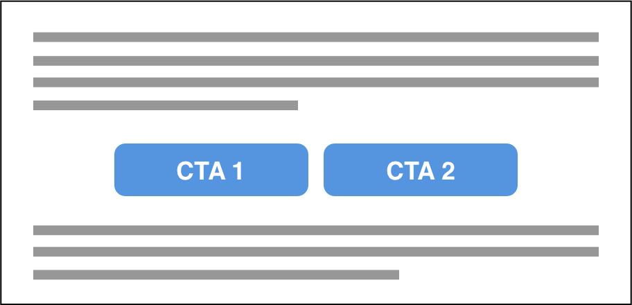
The screen in question had 2 side-by-side CTAs in the middle of the page, but some testers interpreted that to mean the bottom of the page.
12 Usability Issues to Watch Out For
In addition to whether or not participants can complete their tasks, look for the following content and design issues:
Scroll Stoppers
Do users stop scrolling at a certain point on the screen? Are there any visual elements sending the wrong message about the user’s position on the screen? Is information scent missing?
Poor Information Hierarchy
Is content organized in the order participants expect? Does the most important or critical information seem to be prioritized first? Learn more about information hierarchy.
Errors
What types of errors do participants encounter? Are they able to quickly self-correct or even prevent errors from happening in the first place?
Banner Blindness
Are there critical areas of the screen or product participants ignore, overlook, or don’t use? Read more about banner blindness—users can be blind to other elements besides banner ads.
Unintuitive Labels
Do participants second guess themselves when choosing a path? Do they try multiple paths in order to find the right one? Do they skip over the obvious path because the label isn’t intuitive or meaningful?
Poor Readability
Do users make the screen bigger or complain about the point size or font color? Do they ever put their glasses on (or take them off) to see certain parts of the screen, or move their face closer to the screen? Learn more about readability.
Cognitive Overload
Do participants use the back button to look at something again on a previous screen? Do they scroll up and down repeatedly over the same information? Or repeatedly toggle back and forth? Read more about cognitive load.
Insufficient SIGNIFIER
Are users not clicking on or not using certain interactive elements? Read more about signifiers. (Or do you observe the opposite problem—are testers clicking on images, icons, or colored text that’s not clickable?)
Different Mental Model
Are users confused by what they’re seeing or reading? Do they use the interface in unexpected ways?
Poor Proximity
Is content or information perceived to be missing—even when it’s not? Are users constantly scrolling up and down the same screen or having difficulty finding their next action?
Reader Fatigue
While reading, do users sigh a lot or fidget? Does their tone of voice change to monotone or robotic? Do they sound bored? Do they quickly scroll past blocks of text?
Small Touch Targets
On touch screens, do users repeatedly tap on the same link or button before the page loads? Do users immediately click back and click something else in close proximity—indicating they clicked the wrong thing?
Related Articles
- The Art of Asking the Right Questions in Usability Studies
- 12 Less Obvious Usability Issues to Look For
- 3 Tips for More Successful Prototype Testing
- Your (Super Important) Role as a Usability Study Observer
- What to Usability Test First