Have you ever stood outside for a photo—facing the sun—and it was so bright you couldn’t look up at the camera?
Your eyes watered or even hurt?
Poor readability on the web is like looking into an overly bright sky. It can literally cause eye strain and eye fatigue.
Protect your customers’ eyes from the piercing glare of substandard readability.
Readability
Writing and designing text in a way that is easy to read.
Readability is a broad topic and covers numerous aspects of writing and design. Is the content understood? Can the content be read comfortably (is it legible)? Web content cannot be deemed “readable” unless both variables are true.
If you’re currently facing numerous usability challenges, knock out readability first, then move onto the more difficult issues. Reading content should always be easy.
Based on my 20-plus years of higher education, writing, usability testing, and research on the topic, here are the basics of readability best practices:
Writing for Readability
4 readability tips for writers:
Chunking
Chunk text into small paragraphs and bullet points. Use headings to break up multiple paragraphs.
Learn more about chunking, a previous UX word of the day.
Reading Level
The ideal reading level is grade 8, as most Americans read at that level or lower. Most newspapers are written at grade 11 and best-selling novels are usually grade 6 or 7.
For comparison, this blog post is Flesch-Kincaid reading grade level 7.
Check your content’s grade level in Microsoft Word or use similar online tools. To lower the reading level, use smaller sentences, one-or two-syllable words, and simple sentence structure (i.e., ditch the semi-colons).
If you’d like to learn more, there are numerous academic journals on this topic.
Word Count
Shorter amounts of content are easier to read than long ones. Don’t be afraid of short sentences and paragraphs.
I’m clearly not.
Clarity
Use simple words in favor of multi-syllable words. Use layman’s terms in lieu of jargon. Use straightforward language instead of a clever turn of phrase.
Designing for Readability
11 readability tips for designers:
Layout or Width of Text
 Very narrow and very wide columns of text are both difficult to read.
When the text is too narrow, comprehension becomes more difficult. When text is too wide, eye strain increases, then eventually stops readers from continuing.
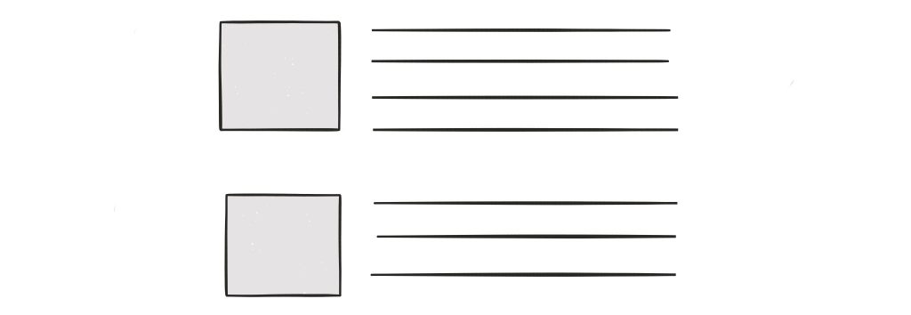
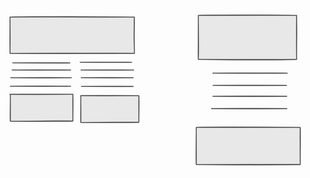
Body text that spans the entire width of a computer screen should be an arrestable offense. (Seriously!) Instead, use margins, photos, or graphics to help decrease the width to a more comfortable size.

In the example above, I used negative space (margins) and images to “squish” the width of the text to a comfortable size.
Fonts
Some fonts are easier to read than others. Serif fonts (fonts that have little embellishments on each letter) are preferred in print, and up until recently, sans serif fonts were preferred for web.
Thankfully, screen resolution has significantly improved in recent years. Serif fonts no longer look blurry.
Today, it doesn’t matter which one you choose, but script and other novelty fonts should be used very sparingly.
Capitalization
All capital letters (ALL CAPS) are more difficult to read than sentence case or title case. Lowercase letters help us recognize individual letters, and therefore, comprehend words more quickly. Plus, all caps just looks like you’re shouting.
- Title case means that each word in a heading is capitalized, except prepositions usually. The headings and sub-headings in this blog post are all title case.
- Sentence case means just the first word in the sentence is capitalized (except for proper nouns, of course).
Bold + Italics
Bold and italics should be used rarely and only for emphasis. It’s more difficult to read an entire sentence or paragraph of bold or italicized text.
Text Color
Colored text is usually difficult to read in long blocks. Again, colored text should be used sparingly (e.g., links, headlines).
Text Alignment
 Left-aligned text — headlines, copy, captions, bylines, or any text containing 2 or more words — is almost always best. The consistent “hard” left edge makes reading smooth and effortless.
Right-aligned text is useful when designing a layout with a fixed height and width (e.g., business cards, PowerPoint). But on the web, right-aligned text causes readability issues due to the jagged left edge. It quickly becomes taxing on the eyes to search for the beginning of each new row.
Centered-text is OK for very small amounts of text — generally, no longer than 3 lines. Anything much longer and reader fatigue begins to set in due to that jagged left edge.
Text Size
Depending on the font, a point size of 16pt is comfortable for most people. As the font size increases, so should the leading (the space between each row of text).
Most designers recommend leading (or line height) 1.5 times the font point size. That is, 20pt text should have 30pt leading.
Contrast
The contrast between text color and background color should be as high as humanly possible. Black text on a white background or white on black (or another very dark color) is ideal.
Gray text is extremely popular right now and frequently complained about in my usability studies. It may look good, but…
Eye Flow
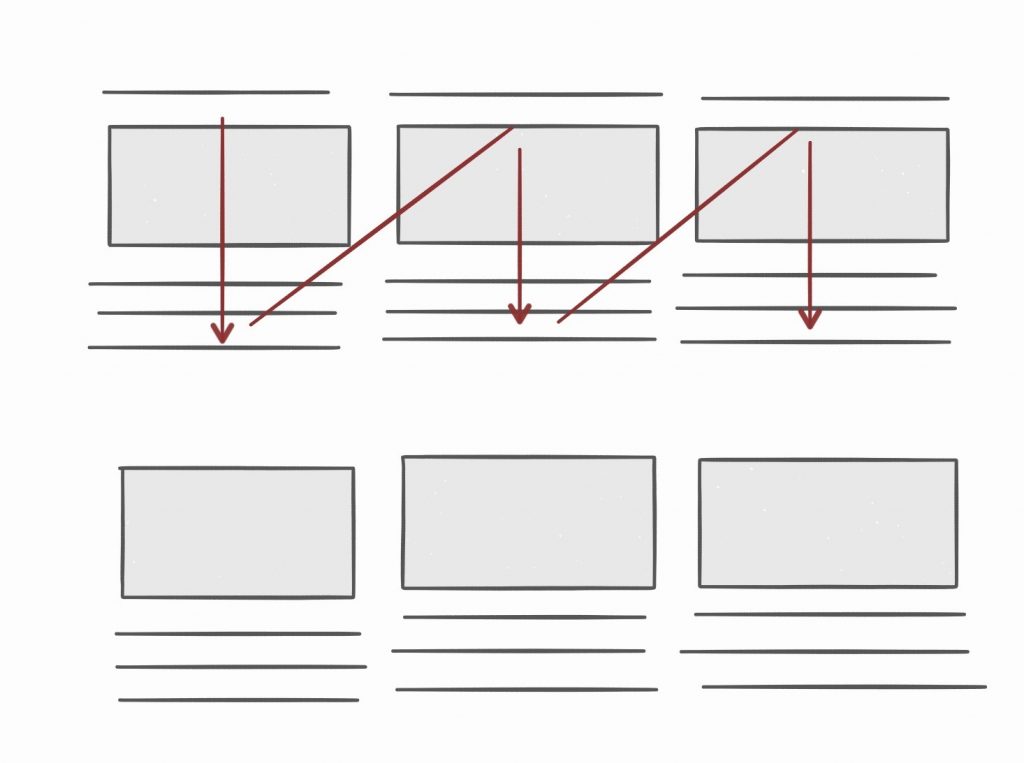
 Keep related content grouped together, rather than separating it. Otherwise, eyes become fatigued bouncing up and down or side to side.
In the example above, I moved the heading from above the image to below the image to eliminate the jarring eye flow.
Padding + Negative Space
 Adequate negative space around a block of text is needed to help our eyes focus and give the content breathing room.
For example, using an extra line break between each paragraph in this blog post makes the content feel more light and airy.
Alt Text
Don’t forget about readability for your customers who cannot see or who have low vision. Ensure images, tables, and other visual elements are translated properly by screen readers.
Talk to your in-house accessibility subject matter expert (or hire an accessibility consultant) to learn more.
See also: UX Word of the Day Index