I love introducing the concept of “information scent” to non-UX designers. They almost always find the concept fun to say and empowering.
Once non-designers understand the definition of information scent—the ability to use design and copy to pull users deeper into an experience—concerns about “the fold” and “number of clicks” quickly fade away.
Scroll Stopper
A scroll stopper is the antonym of information scent.
Scroll stoppers are design cues that tell users: “Stop scrolling! There’s nothing more to see here.”
I find scroll stopper is even more fun to say than information scent. Or when sung to the tune of “Heartbreaker” a la Pat Benatar.
3 Most Common Scroll Stoppers
During usability testing, I most frequently observe 3 types of scroll stoppers:
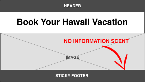
1) Full-screen image / video
2) Too much negative space
3) Sticky footers
How to Stop Scroll-Stoppers
Information scent!
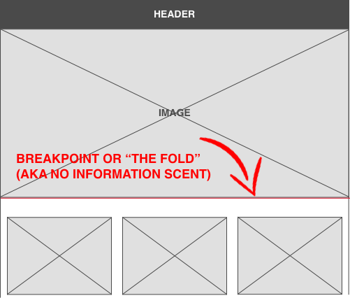
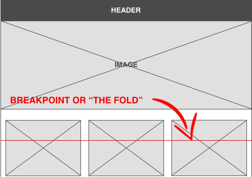
1) Pay attention to breakpoints
Figure out where the most common breakpoints will be, and then ensure your image, copy, video is cut in half at that breakpoint. Users will naturally scroll down to see the rest of the content.
2) Include elements that break the grid
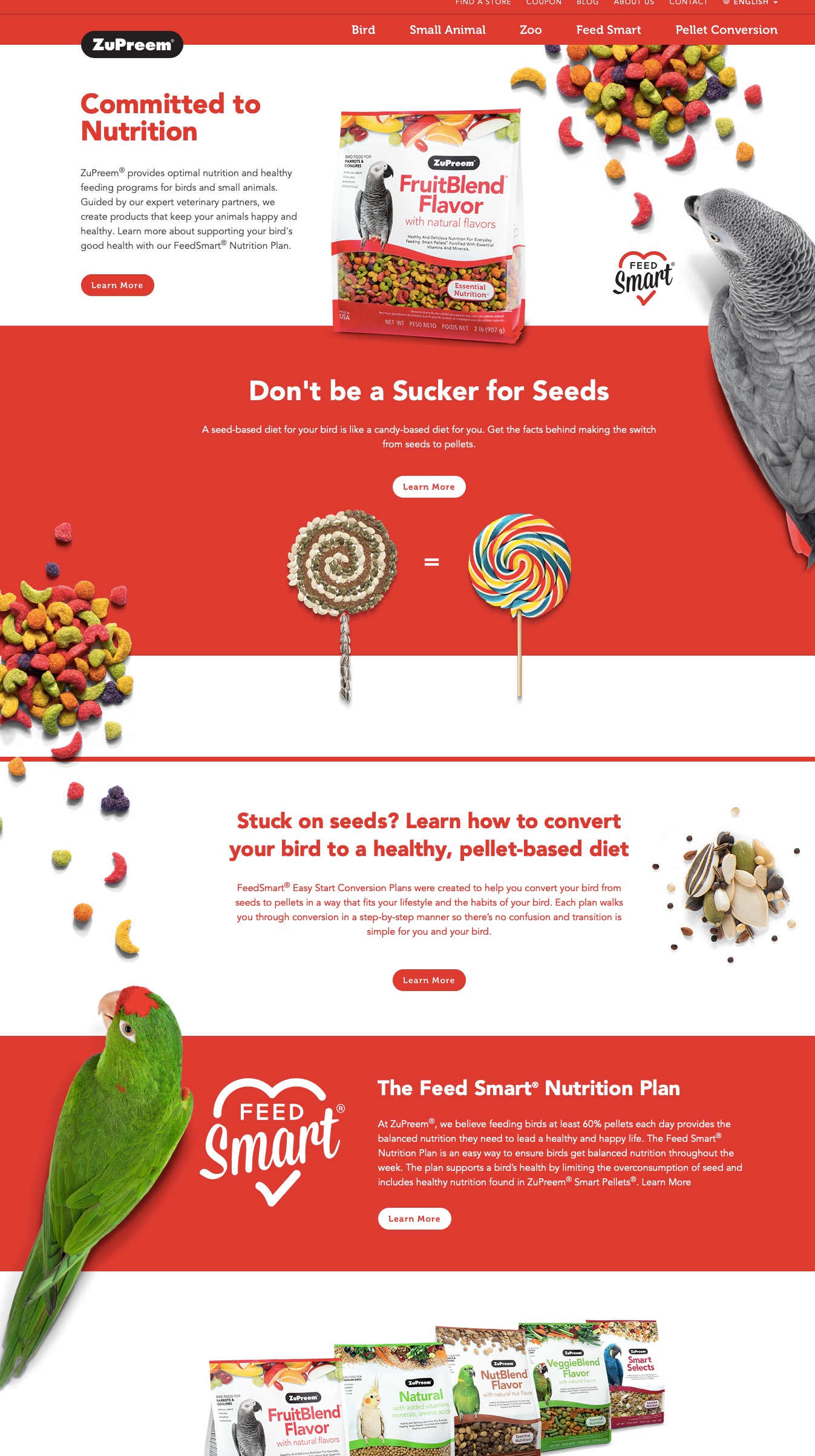
Include vertical design cues to pull the user’s eye down the screen. In the ZuPreem example below, the designer uses images of birds and bird feed that break the grid. Try to to avoid just using a down arrow to indicate more content—it signals lazy thinking.
See also: UX Word of the Day Index
Related Articles
- UX Word of the Day: Qualitative Coding
- UX Word of the Day: Hypothesis Map
- UX Word of the Day: Mental Model
- UX Word of the Day: Wayfinding
- UX Word of the Day: Scroll Stopper