When a crowd forms around a street performer, you become immediately curious, too. You slow down. You stand on your tip-toes to see over people’s heads.
To get someone to be curious online—to scroll or to click—you have to first catch their attention.
Information Scent
Providing an authentic clue or insight into what’s around the corner. “Around the corner” might be on the next page or just below the “fold” — the imaginary line at the bottom of the screen.
I intentionally used the word authentic in my definition, because it’s definitely not about tricking someone into clicking or scrolling. No one ever wins friends using that approach.
In all my years of usability testing, I’ve only seen 2 scenarios where a user doesn’t scroll down the page:
- They’re not interested in the content
- Information scent is absent
Here are 2 simple ways to create information scent and curiosity:
1) Smart Layout Choices
Empty space has numerous benefits — it’s aesthetically pleasing, creates focus, reduces clutter, improves readability — but it has one big natural enemy: the “fold.”
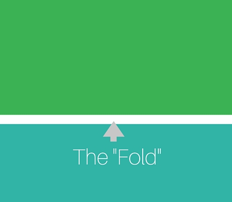
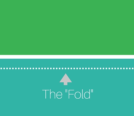
Here’s what I mean, jelly bean:
Without Information Scent

With Information Scent

See the empty space between the 2 elements in the top example? To most people, that looks like the bottom of the screen. It lacks a visual indicator to tell the user to keep scrolling.
The “fold” varies from screen to screen, monitor to monitor, so it’s a good idea to ensure the layout adapts to whatever situations are thrown at it.
2) Smart Word Choices
Information scent isn’t just about the layout of the page, it’s also about using crystal clear language. Crystal clear, intriguing language.
Of the following, which one provides better information scent?
- Click here for road trip ideas.
- Discover 15 ways to keep your kids entertained on a long road trip.