In the world of lead generation, forms are a necessary evil. But there is no need for them to be dreary.
It’s time to put some fun into your forms. Yes, fun!
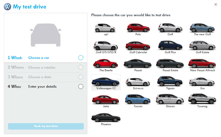
Volkswagen could have easily listed every one of their vehicle models in a drop-down menu. But they didn’t. Instead they displayed every model as a thumbnail image. That’s a little more fun, right?
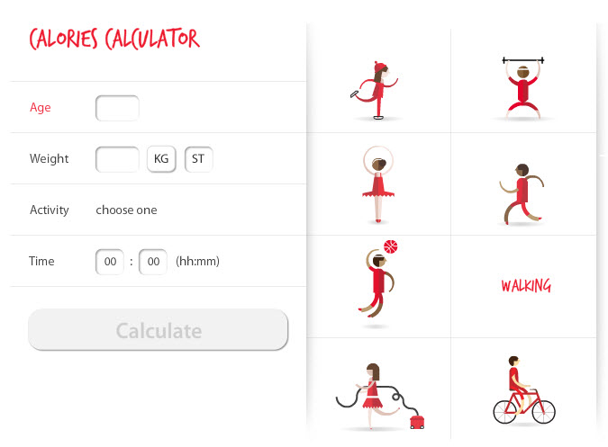
The British Heart Foundation took it a step further than Volkswagen, and created a cute little animation for each activity.
 Other ways to de-drab your forms:
- Sliders
- Calendar pickers
- Maps
- Fun facts / educational tips
- A competition (post a time clock and the average form completion time)


