My challenge: Design an online appointment scheduling interface for a national photography company.
Discovery activities:
- Define business requirements
Research activities:
- Benchmark web analytics
- Conduct contextual inquiries
- Conduct comparative analysis
- Conduct usability tests
UX design activities:
- Create use cases
- Create user flows
- Create annotated wireframes
- Create clickable prototype
For this project, I primarily worked with a business analyst, web developers, and IT and marketing stakeholders.
I used Visio to design the user flows, use cases, and annotated wireframes; and used Adobe Professional to create the clickable prototype. I planned and facilitated all aspects of user research and usability testing.
Prior to the project, I was very familiar with the existing online scheduling experience and how it performed. Lots of people clicked into the appointment interface, but very few users could figure out how to schedule an appointment due to poor usability.
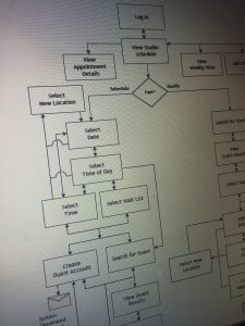
Step 1: User Flows
To learn more about the current state experience, I led an internal workshop with the developers and business stakeholders to map the current user flow.
During this process, I learned the new web application needed to accommodate 3 different target audiences:
- Consumers (moms of young children)
- Studio photographers
- Customer service representatives
Step 2: Contextual Inquiries
Due to my familiarity with the website, I already knew what the consumer-facing experience looked like, but had no idea what the studios and customer service team used to schedule appointments.
To find out, I traveled to different photography studios to observe in-person how photographers scheduled appointments, and then asked follow-up questions to further understand their tasks, pain points, and needs.
I conducted a similar in-person study with customer service representatives.
Step 3: Comparative Analysis
At the time, very few competitors had online scheduling applications. Most required users to call to schedule an appointment.
To gather additional insights, I looked in other industries, such as hair salons, mechanics, computer repair shops, and health clinics.
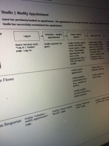
Step 4: Use Cases
To ensure the entire team was on the same page, I created multiple uses cases to illustrate different states in the experience (new user, returning user) and user scenarios (choose different location, edit appointment).
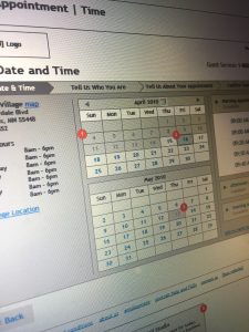
Step 5: Annotated Wireframes
I took the best ideas from each comparative scheduling experience and combined them with the business requirements and user findings to create an initial set of wireframes and site map, including:
- Find location
- Choose appointment date and time
- Input appointment details (e.g., number of people)
- Create an account
- Manage customer profile (e.g., change email address)
- Manage appointment (e.g., change date of appointment)
- Look up customers (internal use)
Step 6: Usability Testing
At multiple points during the wireframing stage, I conducted usability tests on clickable prototypes — both with consumers and employees that would use the new system.
All moderated usability studies were conducted using the “think aloud” method and rapid iterative testing approach (RITE). With each round of usability tests, fewer and fewer usability issues were uncovered. By the final round of testing, no usability issues were uncovered.
Related Articles
- My Experience Taking the CCXP Exam
- Strategies to Bring More Collaboration into Your Everyday Work
- My Favorite UX & Non-UX Resources
- UX Case Study: New Customer Onboarding Journey Map
- UX Case Study: Landing Page Trust Cues