No, it’s not an oxymoron to say “UX-first transactional emails.”
It really is possible to make run-of-the-mill emails engaging AND reinforce your brand.
By transactional emails, I mean:
- Your order has shipped
- Your status has changed
- Your password has been updated
- We’ve received your return
If you’re not familiar with TurboTax first-hand as a customer, the user experience of their web application is legendary. Simple. Elegant. Customer-centric.
And now — as of this latest tax season — their transactional emails have successfully captured the look & feel and whimsy of their web app, too.
UX-First Transactional Email Examples
While not every email I received from TurboTax hit a home run, I took screen captures of the best ones — plus reasons why I think these emails are top-notch.
TurboTax uses a wide variety of email templates — some are winners, some are not. In some cases, the templates and execution are so different, I strongly suspect that different teams are sending them. I didn’t show them here, but they look how you imagine. (Dull.)
Tip: Many of these examples are smart ways of approaching other types of emails and even websites.
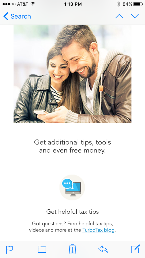
Get Additional Tips
This is a great use of one of my favorite content patterns, which I call the “1-up content block with image.” Icon, header, and a few lines of text. So easy to skim!
Your Refund Is On its Way
Simple and to the point. It’s not as whimsical as some of their other emails, but it does the job. What I like most is the straightforward next steps.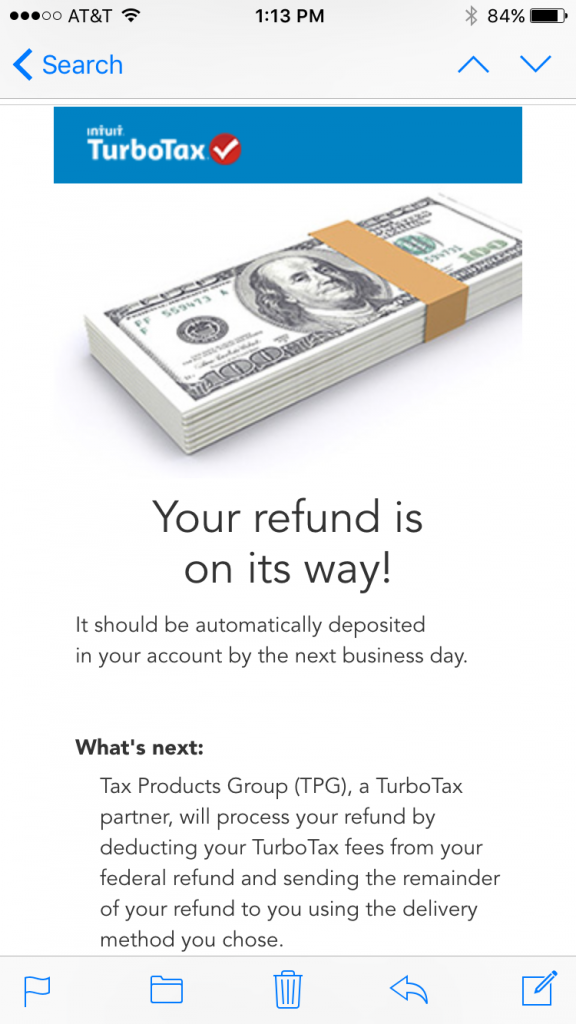
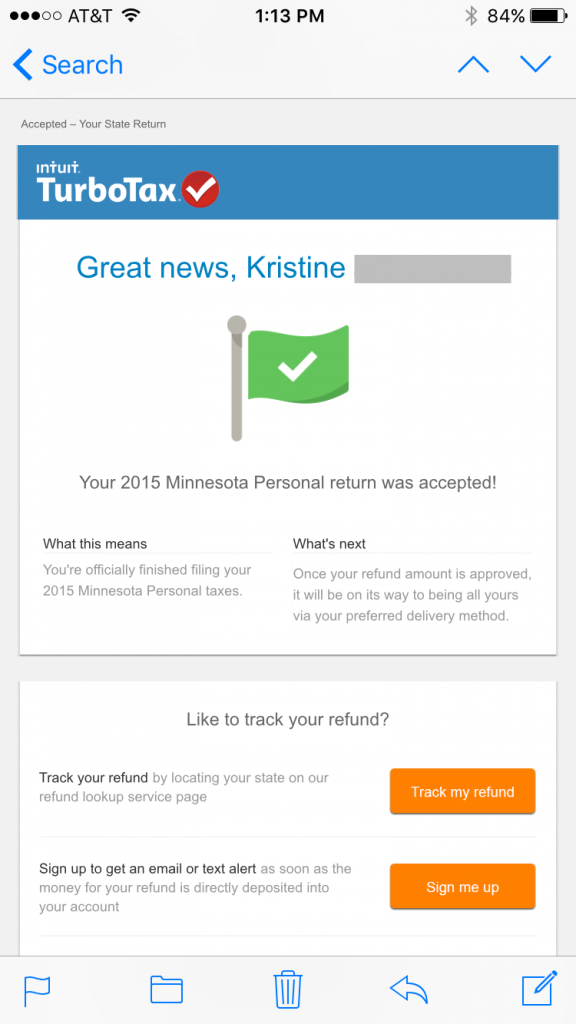
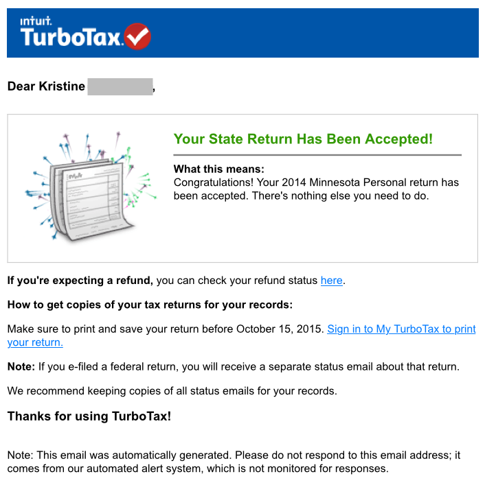
Your Return Was Accepted
Nice use of the color green and a checkmark to reinforce the positivity of this message.
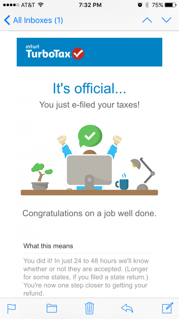
Congratulations!
I love this email so much, I show it to everyone. C’mon, when your customers do something big and momentous, you celebrate it and recognize their effort. The adorable graphic is packed with all sorts of charm.
Why These Emails Are UX-Awesome
To recap, here are all the things I love about these TurboTax emails:
- Great use of illustrations. The graphics aren’t there just to fill space, but actually communicate a message.
- Fantastic use of negative space. As I always say, “negative space creates focus.”
- Minimal copy with a positive attitude. “You did it!” is a great example of an upbeat, customer-first tone.
- Clear next steps that are actually called out as “next steps.” Literal always works.
- Straightforward calls to action. While I wish there was only one main CTA per email in the third example, they do a nice job of making them prominent and purposeful.
For me personally, I prefer the emails with illustrations over the ones with (stock?) photography. The illustrations feel more on target with their brand.
I still have my TurboTax emails from last year. Compare the before and after:
Related Articles
- Experience Is Experience Is Experience
- What Are the Different UX Career Options?
- How to Get Real-World UX Experience without Going Back to School
- Designing for Inclusion & Accessibility: The Giant List of Use Cases
- How Product Management & UX Work Together