What is a GOOD alternative to the ubiquitous hamburger menu? Ahh… It’s difficult to find a mobile site that doesn’t use it.
By alternative to the hamburger menu, I don’t mean what icon is a good replacement.
Instead I mean, is there a better way of displaying global navigation besides hiding it behind a single word, phrase, or icon? Every time I usability test the hamburger menu, it performs badly. Most people don’t notice it or even know what it is.
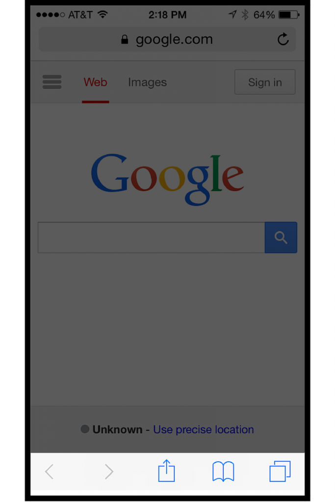
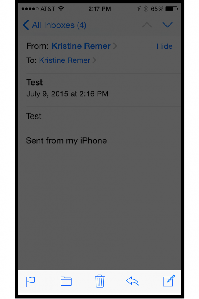
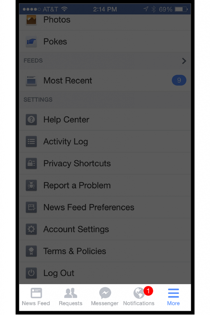
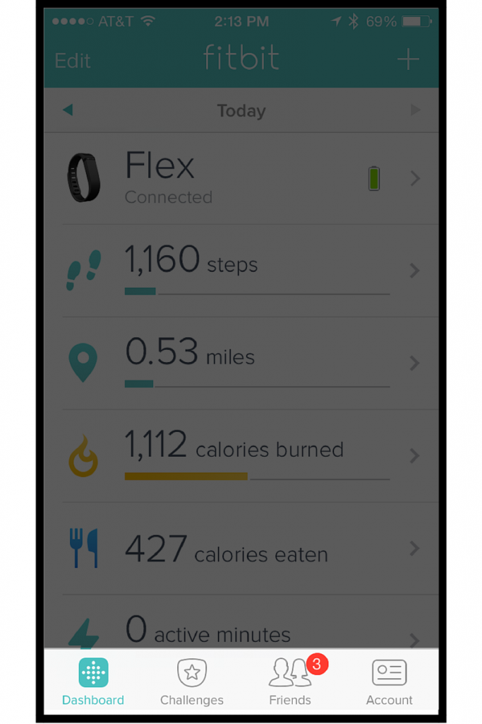
I think there might be a better solution… What do all of these 5 popular applications have in common?
Safari Web Browser
iOS Email
Facebook
Twitter

FitBit
Goodbye Hamburger, Hello Bottom Navigation Bar?
Instead of locking navigation to the top of the page, why not lock it to the bottom on mobile? It makes sense logistically.
- It’s closer to where our thumbs naturally hang out. No strenuous stretching required.
- We spend most of our time looking at the bottom half of our phones anyway (think text messages).
- According to the data, people spend only 20% of their time on the mobile web, but 80% in mobile apps. It’s just what we’re used to.
I’ve seen some interesting and innovative ideas on Dribbble, but nothing in the wild yet on a real website (besides mobile apps).
Related Articles
- Experience Is Experience Is Experience
- What Are the Different UX Career Options?
- How to Get Real-World UX Experience without Going Back to School
- Designing for Inclusion & Accessibility: The Giant List of Use Cases
- How Product Management & UX Work Together