If you haven’t witnessed a usability study before, you may have wondered what types of issues test participants find, and how many issues they typically uncover. 5 issues? 50 issues? 500 issues? Gulp.
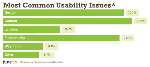
Of the 100+ issues I uncover in a typical usability study, more than one-third are content-related.
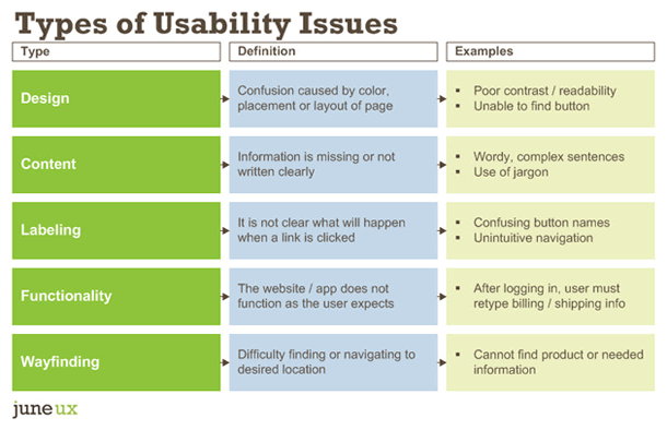
Types of Usability Issues
I conducted my first usability study in 2006. I asked someone in the IT department to haul an extra PC into an empty conference room for me, then I recruited 6 or so participants via our customer database. It was about as unsophisticated as you could get — no recording software, no observers. It was just the participant and me (taking frantic notes).
Since then, I’ve conducted more than 400 usability test sessions — in formal labs, not-so-formal labs, in coffee shops, remotely and even guerilla-style (where I ambushed some willing moms at the mall).
When collecting usability study findings, I usually classify them into 1 of 5 categories: design, content, labeling, functionality and wayfinding. Depending on the type of project, there might be a 6th category, such as merchandising for an e-commerce site.
I think it’s a good idea to classify usability issues because this extra step can help make divvying up the workload after the study easier. For example:
Categorizing usability issues also helps the project team more easily understand how to solve the issue.
For example, if a user cannot find the “Continue” button — is it because of the button label or because the button is located in an unexpected place on the page? As the facilitator, I know that test participants did not scroll down on the page far enough to see the button. Categorizing this finding as a “design” issue, rather than as a “labeling” issue helps ensure the team solves the right problem.
Usability Results: By the Numbers
Disclaimer: The following represents my own experience. Your results may vary.
To answer my earlier question about which type of usability issue is most common, I pulled out the findings from 10 recent usability studies. The following data comes from 8 websites and 2 web applications from various organizations.
There were 5 to 8 participants per study, but most had 8 participants. All 74 usability test sessions were 1 hour in length and included anywhere from 5 to 8 tasks per session.
On average, each study revealed 113 usability issues. The studies uncovered as few as 67 issues and as many as 178. In total, 74 test participants found 1,126 usability issues across 10 websites and apps.
And so without further ado, here were my findings:
Together, content and labeling issues made up 38.6% of the total usability issues on these 10 sites.
We’ve heard it a million times: content is king. However, I like to put it another way: content is the user experience.
Often user experience isn’t about navigation or drop-down menus and radio buttons. A website can be flawless functionally and visually, but if the information users expect isn’t there or they don’t understand it, nothing else matters.
The great news about finding content usability issues is that they are the least expensive type of issue to fix — little to no developer time is involved. Of the 5, wayfinding is potentially the most expensive. If people cannot find their way to critical information, something is fundamentally broken.
Apply My Findings to Your Next Usability Study
So now that I did all this analysis… what is the big takeaway?
I am a huge fan of prototype testing. Usability testing wireframes – or even hand-drawn sketches – saves a ton of money vs. waiting until everything is coded and “perfect.” But here is where I would use caution when prototype testing…
Use real content in prototypes
Since content is such a huge part of the user experience (and number of usability problems), I implore you to use as much real content in your prototype as possible.
Lorem ipsum (AKA placeholder text) might be passable for wireframes, but absolutely not for prototypes.
Test participants almost always inquire about greek text — “what is that, what language is that, I can’t read that” — and you end up wasting valuable time telling them to ignore it.
Hire a writer who specializes in web writing
If you haven’t done so already, hire a web copywriter to write content for your prototypes and make sure they — plus the design and development teams — observe all of the usability test sessions.
Test, then test again
Early prototypes also will likely lack design elements, such as color and information hierarchy — so it is critical to test again during the design phase. But I wouldn’t wait until the design is complete to test it for the first time. Testing early may yield brand-new ideas, increase scope, decrease scope or even confirm that you are on exactly the right path.
Happy testing!
Related Articles
UX Word of the Day: Content Chunking
The 5-Step Process I Use to Plan + Conduct Usability Studies
Steal These Mobile-First Content Patterns


