Done right, megamenus are an elegant way to display a ton of navigation. I have noticed lately that more and more companies are integrating photos into their megamenus as well.
For users on tablets — or those who are just more visually-oriented — including images of your products, your product categories, your people, or your most popular links is a great way to make your site more easily understood.
Besides… they say a picture is worth a 1000 words, right?
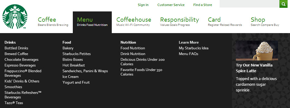
Starbucks
Use caution implementing an exact replica of Starbucks’ megamenu. There are 2 usability flaws to note. First, if the megamenu drops below the fold on smaller screens, there is no way to scroll down to see links on the bottom of the menu. Second, if you move your mouse to the left or right too far, the entire menu disappears. It would be better if the black bars on either side weren’t there. (Visit the site to see what I mean.)
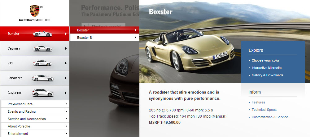
Porsche
The photography is gorgeous , but be weary of flyout menus. I have yet to see a menu that flies out horizontally like this perform well in a usability study. Too often, users struggle to align their mouse perfectly in order to reach that third tier of information.
Gateway
Simple always wins.
Moment Skis
I adore the concept of using a windowshade to navigate. Make sure it’s not the only way users can navigate though… they may not notice (or have the energy) to keep clicking for more. There is more work to do on the analytics side in order to track user behavior, but this application might be worth it for your situation.
Head Case

“Head Case” was a TV show on Starz back in 2007-2009. I have no idea how I originally tracked down this website because I have never heard of this show. None the less, I bookmarked it for its cool megamenu. (The actors animate on mouse-over.)


