UPDATE: I launched a shop on Etsy about 2 weeks after this post was published. A lot has changed on Etsy since this post was first written in 2012.
I first discovered Etsy in 2006 and was immediately addicted despite my poor success rate of finding anything I actually wanted to buy.
Here was my typical experience: search, surf awhile, refine my search, surf for awhile, refine my search again, surf for a few more minutes, and then finally hopelessly give up at 1 o’ clock in the morning.
Fast forward 6 years later and my behavior is pretty much the same, except now I religiously use the “favorite” feature (or pin to Pinterest) because now I know I will never find that same item ever again.
If you’re not familiar with Etsy, it is a collection of independent shops who sell (mostly) handmade items such as purses, jewelry, clothing, toys, accessories, furniture, food, and art. Buyers purchase items directly from sellers, and then Etsy collects a small listing fee and commission on each item sold. It has easily turned millions of stay-at-home moms and starving artists into small business owners. (Yay!)
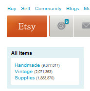
 As much as I love the concept of Etsy and adore the many items I have purchased over the years, I do not love the user experience. In a word, it is horrible. At present, there are 9.3 million items on Etsy. Yes, that’s right. Nine Million Products. With that many products on a website, search and navigation must be absolutely impeccable.
But it is not.
If I were director of user experience at Etsy, here are 6 ways I would improve the usability of the site.
1. Establish photography standards.
Without a doubt, the poorly lit and fuzzy photography that runs rampant on Etsy negatively impacts the entire user experience. Plus, it puts shops with great photography at an unfair disadvantage. The more bad photographs users must wade through, the less likely they will reach the shop with the great photography and fabulous products. In my experience, shops with great photography tend to have many more sales. (Funny how the 2 are correlated.)
2. Add filtering.
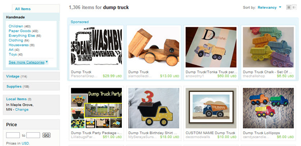
If you have 8 hours to kill, use the left navigation to shop on Etsy. Using the site this way means viewing hundreds of thousands of items in each category and tens of thousands of items in each subcategory. The only way to find anything on Etsy is by searching. When you enter a keyword in Etsy, the search engine uses product names and product tags to display items by relevancy.
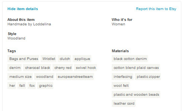
Shop owners can add up to 13 tags plus up to 13 material tags (e.g., wood, felt). Tags are a fantastic way to add meta data to a website – if done correctly. Unfortunately, Etsy does not standardize tags, rendering them pretty much useless. Let’s pretend a user searches for “aqua diaper backpack,” but unfortunately, the seller tagged the item as “turquoise” and “diaper bag.” Consequently, buyer and seller will never find each other.
3. Eliminate pagination.
Pagination is dead. Or at least I think it should be. Pagination was chiefly invented by publishers as a way to increase page views so that they could make more money on advertising. Large sites such as Twitter, Google, Linkedin and Facebook are already moving away from pagination.
What do I mean by “pagination?” Instead of viewing 10 items per page, then clicking “next page” to view the next set of 10, users click “show more” and now view all 20 items on the same Web page – making it easier to compare and return to previous items.
Pagination is especially devastating for Etsy. When the number of search results is almost always in the thousands or tens of thousands, viewing 40 items at a time is, well, time-consuming and exasperating.
4. Build a (better) recommendation engine.
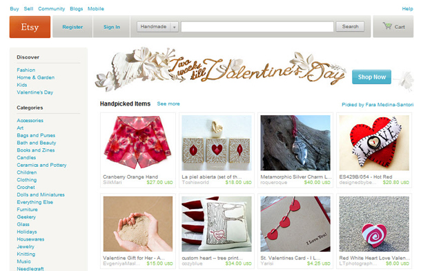
If Etsy has a recommendation engine, it’s not at all obvious to me. I have “favorited” hundreds of items and dozens of shops and purchased many items in these past 6 years, and yet Etsy has never shown me relevant products on the home page. Instead I’m shown a group of items curated by an Etsy member, of which rarely match my tastes. Or they show me “items matching my taste” — based on a quiz I took on Etsy — which rarely match my tastes. You see the humor in this, right?
5. Eliminate duplicate categories.
There are multiple ways to browse for toys on Etsy. You can select “Toy” in the left navigation. Or, you can select “Children,” and then “Toys” from the subcategory list. But there are consequences if you choose the wrong path. You will see two entirely different sets of toys.
Note: The categories are actually helpful when searching on Etsy. You can use them to help filter your search results.
6. Display personalized search results.
If Etsy wants to dramatically grow revenue, it is imperative that they build an intelligent search engine. That is, display results based on a combination of factors: past browsing and purchase behavior, popularity (e.g., purchases, views), relevancy of keywords, social media influence (e.g., number of backlinks), and predictive selling.
A smart search engine would eliminate the loophole that allows some shop owners to “game” the system by constantly relisting their items and adding non-relevant tags to their items in order to appear on the first page of search results.
In addition, search results should include “layered” or multiple sets of search listings, then allow users to choose the set that works best for them. Examples of search sets:
- Regular search listings
- Most popular items
- Recently viewed items
- Editor’s Picks
- Sponsored items
After poking around on Google for a few minutes, I discovered that Etsy routinely conducts usability studies – which is great news! It is clear that Etsy works hard to support its shop owners in other ways also – with community discussion forums, shop makeover labs, featuring sellers, partnering with West Elm, craft nights, and, of course, an extensive how-to guide for new sellers. It is rare to find a brand that gives so much back to its community. You can’t help but root for such a special company.
Now, your turn. If you were director of user experience at Etsy, what would you change? Tweet me @KristineRemer.


